Architecture Photography

Photographing The Apartments of South Los Angeles

You'll have to excuse my absence over the past few weeks: things have just been immensely busy and it's all I can do to stay on top of my post work. Late nights have never been so frequent!

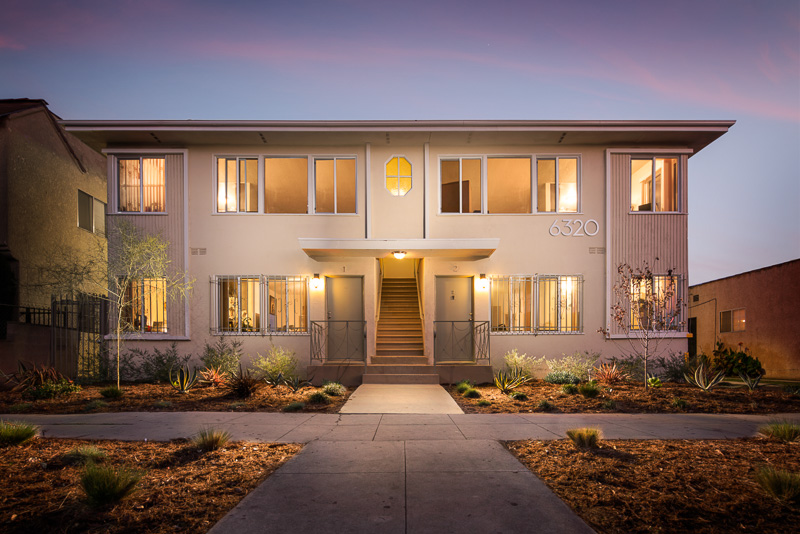
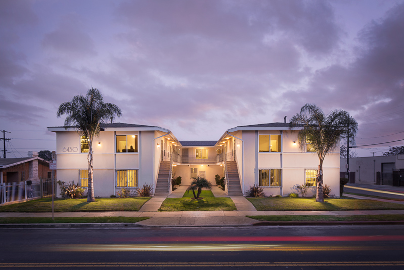
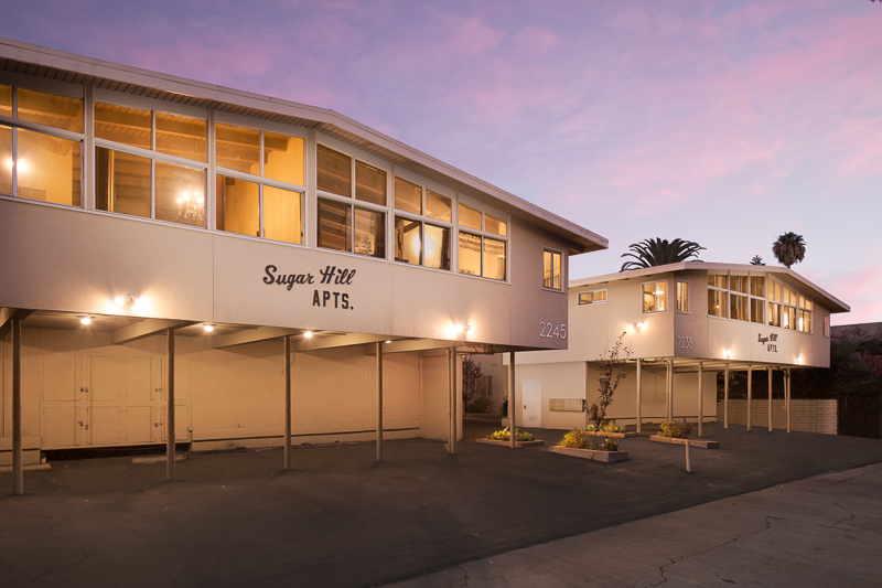
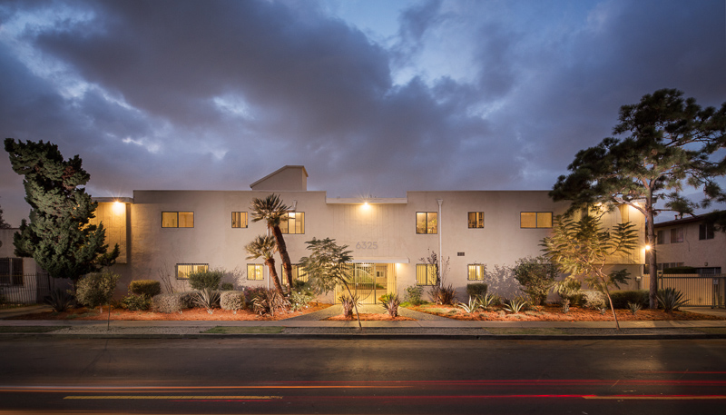
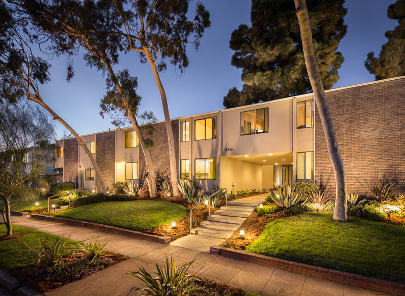
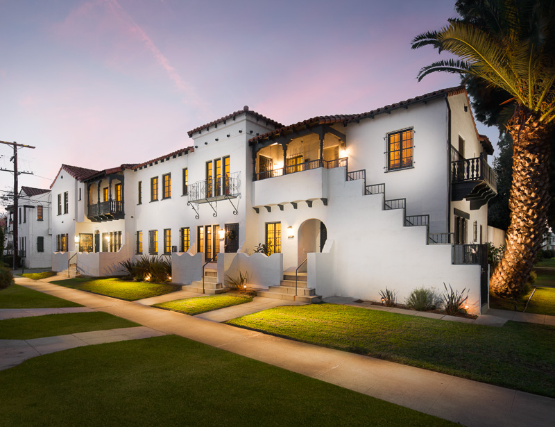
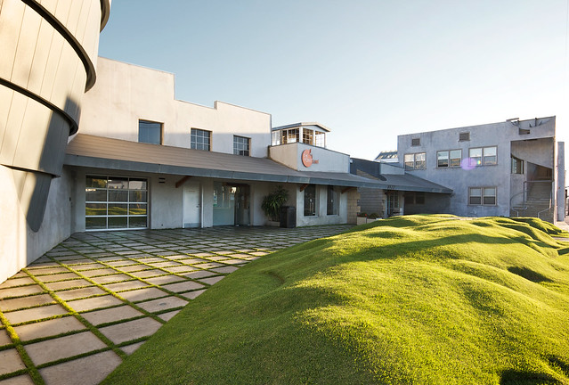
Over the past few weeks, I've had the pleasure of working on one of the most fun assignments ever: working with a management company to photograph some of LA's famous dingbatty, mid-century, garden, kitschy apartments. To be honest, the style of architecture is all over on some of these, so if anyone knows what they would technically be called, I would love to hear it. Anyway, these assignments are incredibly rewarding for a number of reasons. 

First, they are the complete and total opposite of what I normally shoot. I'm used to shooting homes and offices in tip-top condition; they're usually straight and true, with no cracks in walls or bars on windows. They're often in secluded, quiet parts of LA, where I don't have to put myself or my gear at risk of damage due to cars whizzing past. I usually have to coordinate with one homeowner or building tenant, which makes getting lights on easy. In many cases, there are over 20 tenants who need to get their lights on for us. There are pedestrians and cars everywhere - curious onlookers and the occasional cyclist coming inches from knocking my whole setup over.

We often close down the entire street in front of whatever property we are shooting - which gives us some room to work - but sometimes, this just isn't possible, so composition can be severly limited. Space is also deceptively tight, here, which means it really needs to be nailed with only one shot per location. The technique here is fairly standard light-duty strobist-type work, but the heavy lifting is really in the post. I'll get some before and afters up pretty soon (new website in the works) but some of these have hours upon hours of cloning, rebuilding, and, well, imagineering put into them.

Below, a few of my favorites, and soon to come, a whole new batch. When we're done with the entire lot (20-something of them at last count) I'm going to try to get these into a gallery of sorts or have a book made. It would be cool to see these printed in large format.


Architectural Photography: Light Painting A Winery From a Half-Mile Away

I once again loaded up the car and headed away from Los Angeles to the Salinas Valley to photograph the Hahn and Wrath Wineries, both of which are located around an hour from Carmel in an amazing setting. Shooting these wineries presented a number of challenges, and I'm going to talk a little bit about how I overcame them. I know I've been on a bit of a hiatus lately, but hopefully this post makes up for it. 
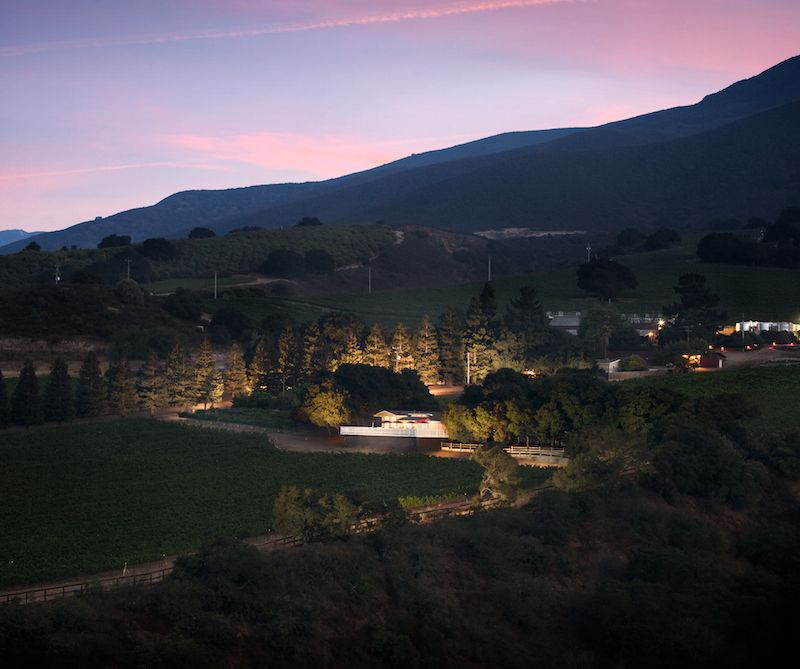
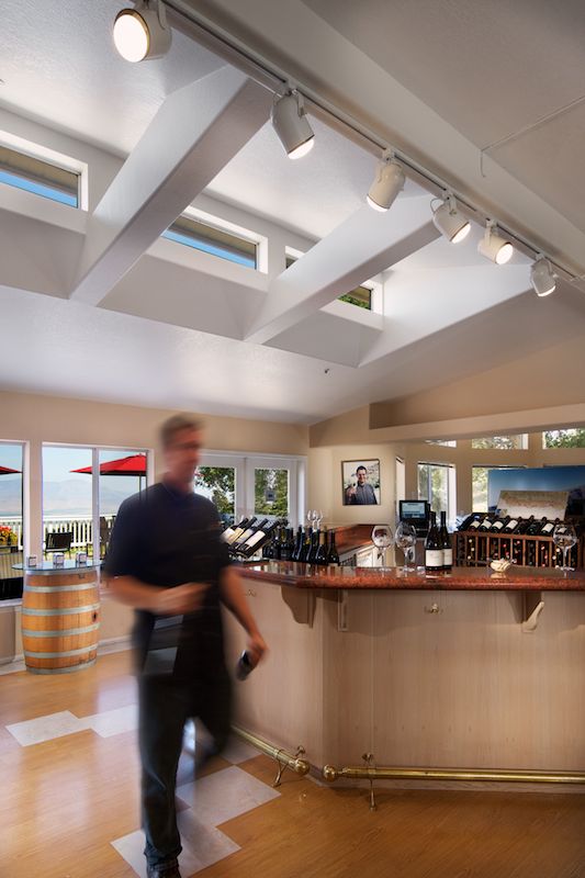
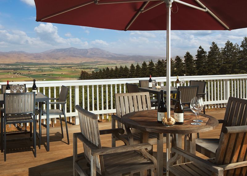
First, let's talk about the shoot I did for Hahn Wineries in Soledad, CA. The client had a few ideas for shots that they knew they wanted, and they more or less left the rest up to me. I was given a tour of the grounds, and immediately settled on a few shots, and scratched my head over a few more. They had mentioned that they wanted a few great shots of their tasting room, which is one of their big attractions for visiting customers. The problem was that the tasting room is elevated about 20 feet off the ground on a steeply sloped hillside, and was entirely surrounded by trees on the high side. Any hopes of me creating an architecturally interesting photograph from the ground were quickly dashed, and my options seemed to be severely limited to either renting a helicopter (expensive) or using some extremely tall and unstable pole to shoot from the slanted ground below (a bad idea, and generally unsafe). 

While walking around and talking to the client, they pointed out a ridgeline on the other side of the valley where they often took customers on the tour to see the entire layout of the winery and its vineyards. I was initially reluctant to try to shoot from this vantage point, as the small size of the tasting room would require some serious telephoto reach and would eliminate nearly all of the architectural appeal of the building. On a whim, I asked if we could take a ride up to the ridgeline to see if we could gather any other shots, and it turned out to be a pretty great vantage point from which to shoot the tasting room. 

While I didn't end up zooming in that far (we ended up shooting at 50mm) the shot actually looked like it might work. While you lose some of the architectural details of the tasting room, you do get an incredible view of the grounds and the sense of scale becomes immediately evident. I made a decision to make the twilight shot more about the entire winery rather than just the tasting room, which I will admit was a little daring on my behalf. 

After choosing where to take the photo from, it was just a matter of playing the waiting game until sunset. Once dark enough, I had my assistant Jaron  head back to the tasting room armed with a big light and a walkie talkie.

Because of the distance involved and the fact that I was standing on the side of a valley, we weren't able to use PocketWizards to light the scene as I usually would. This was simply too far, and I didn't want to try to wrangle multiple PocketWizards in relay mode from my position, down to the valley floor, up the other side of the valley, and again to the tasting room. Too much time and effort for something that franky just didn't seem like it would work. So we tried another untested method - I would talk to Jaron on the walkie talkie, count backwards from three, and open the shutter for a long exposure. He would (ideally) then pop the flash manually while the shutter was open for the 3 or so seconds I'd set it to, and the sensor would record the flash pop. Here's one of the frames that was composited so you can see what I'm talking about:
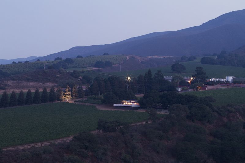
I'm happy to say that we were somewhat succesful. For this exterior view, we delivered two shots - one with light trails, and one without. I wanted to give a sense that you might be able to take a sunset winery tour in the ATVs provided by the facility, and even though the client didn't request it, I thought it was a cool add-on with minimal work involved, so I threw it in anyway.
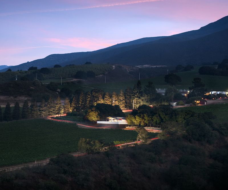
 

So, all that effort - do you think it was worth it? It's certainly a unique shot, the likes of which I don't have in my portfolio and it was something I don't think I'll be trying often. Another challenge for me was dealing with the fog that rolls into the valley and the haze that forms as a result. I'm not sure if it gives this photo a bit of mood and a sense of place, or if it just distracts. 

Below are a few more images from the job - my personal favorite is the image of the tasting room, shot with a Lowel GL-1 hotlight in complete darkness. 
 

Shooting Architecture in Culver City: An Architectural Photographer's Playground

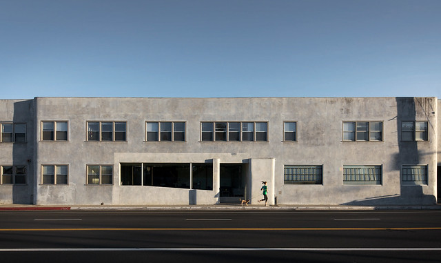
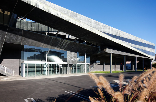
Culver City, CA, is a veritable goldmine of stunning architecture. Below are the offices of Media Temple, a web hosting and domain service. A very unique building that was a lot of fun to shoot! I channeled my inner Edward Hopper in an effort to create some interesting architecture images, and I'm especially fond of the image that includes the woman running with her dog. If you ever have an afternoon to kill in Los Angeles and you're interested in architecture, I'd definitely recommend parking your car over here (it's all free!) and taking a self-guided walking tour of the architecture in this area of Culver City, located near Jefferson Blvd near Baldwin Hills.


Behind the scenes on an architectural photoshoot

I recently enlisted the help of my friend and local videographer, Peter Donaghy, to create a behind-the-scenes video of an architectural/advertising photo shoot at the Arclight Theatre in downtown Hollywood. It goes into a bit of detail about my method, including the on-location work, a look into what the camera is capturing, and a view of all the post-processing that is done to create an image of mine. We spent a ton of time on it and I hope that it gives you some insight into my process.

Enjoy!


Mike Kelley: "Baiting With Light." mpkelley.com featured on Pocketwizard website

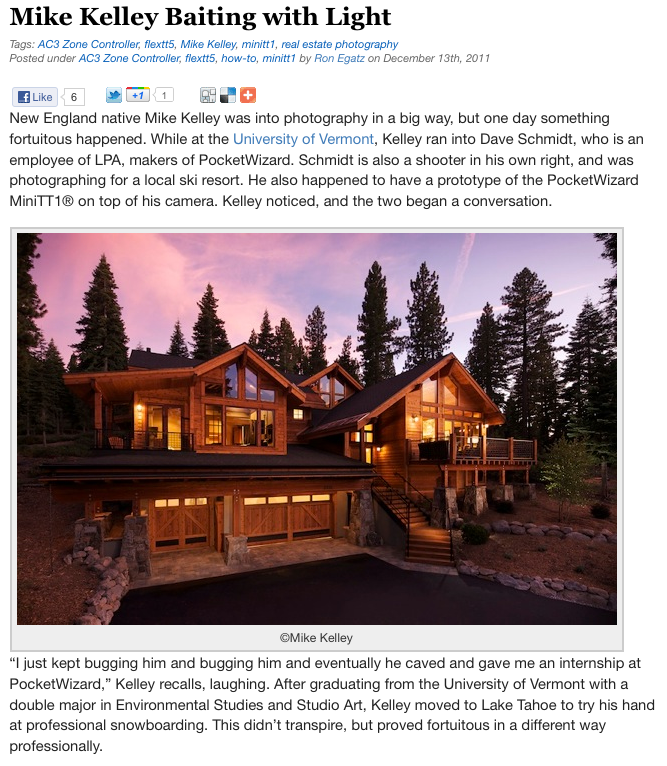
Off-camera lighting specialists Pocketwizard recently featured my work on their website and in their blog. The article goes into detail about how I got started in interiors and architectural photography, as well as explains some of my techniques and methods used to create my images. I think it's well worth the read, and they did a fantastic job writing both an informative and somewhat humorous article. An excerpt of the article can be read below, and the entire article can be read by clicking here.


Thanks to Ron Egatz, Dave Schmidt and everyone at Pocketwizard who has offered assistance or put up with my questions for the past few years!


Updated blog, and a few new behind the scenes videos

After a few months of much re-organizing and shuffling, the blog is back. I hope you can forgive me for the downtime and removal of the old blog, but it needed a refresher with regards to content and style. So without further adieu!

Our first post brings us a few video updates. You may have noticed these in the 'about' section of the site, but if not, I've recently made a couple of 'behind the scenes' movies. The first one, by Peter Donaghy, is a quick look at how I work on location.

And secondly, though a little older, is a behind the scenes video of my capture and post processing. This video was featured on www.strobist.com, one of the most popular photography resources in the world, and garnered nearly 40,000 views from that one site in a month alone. Check out the strobist article here, and the video below: