photoshop

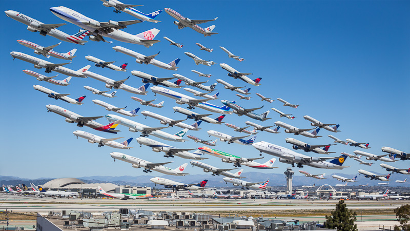
Photographing Every Departure at LAX's South Complex: "Wake Turbulence"

I just spent about 16 hours shooting and putting this image together, and I've written a little blog post, below, detailing some background information and how I did it. While not specifically related to architectural photography, I still find it interesting enough to write and post about, so you'll have to tolerate the tangent this week.

PurePhoto, who sells all of my fine art works, has graciously agreed to offer prints of the shot in 18x36", 27x48", and 36x64" sizes on Hahnemuhle archival fine art paper. I have to say, the shot is truly stunning in large format and anyone who appreciates aviation, infrastructure, travel or imagination could easily spend countless hours getting lost in it. To order prints and view availability, click hereor head to my galleries on PurePhoto.
Los Angeles is a city steeped in aviation history and technology. Over the years, Los Angeles and Southern California have played host to some of the largest aviation companies and activities the world has ever seen. From designing and building Lockheed's top-secret reconnaissance planes to building some of the first large-scale passenger aircraft and having Maverick buzz the tower only a shrot drive south at Mirarmar, aviation is everywhere in this region. Our main airport, Los Angeles International (LAX) is one of the busiest airports in the world and countless airlines use it as a focus city for both international and domestic operations. 

The idea for this photo wasn't some grand thing years in the making, or planned over months. It was simply a clear day in LA and I felt like a total dork sitting inside on the computer. I had to do something. The day before, I was with my friend David Huff at LAX for lunch and some plane-watching, but the smog was out in force so nothing too special happened in terms of photography that day. Since I am generally interested in making photographs that aren't just snapshots of a single moment, I had a thought that it would be interesting if I could seem to capture more than one plane in flight at once. And from there, this idea was born.

This has been done before, yet slightly differently. Ho-Yeol Ryu created a similar piece set at Hannover airport. This showed that what I wanted to do could be done, albeit quite differently. Ryu used planes of all liveries and countries, and took a bit more of an artistic approach in his rendering. My intent was to capture only planes that flew out of LAX - highlighting and emphasizing what an incredible airport that this city has. It's really fascinating to look at all the planes heading in different directions, ferrying people all over the world, all originating from Los Angeles. In this shot alone, there are planes heading to destinations on six continents - either direct or via multi-stop routes on the same flight number. Guangzhou, Auckland, Frankfurt.

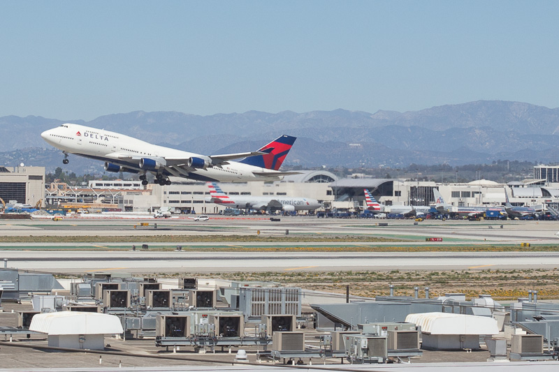
In order to capture the shot, I set up a tripod and photographed every single plane that flew across my frame anywhere from 3 to 10 times. Using sandbags to ensure that the camera didn't move and coming as close to peeing myself as I ever have in my 26 years of existence from not wanting to leave my camera unattended, this resulted in over 400 images from which the composition is built, but not all of them were used. Here are a few of the individual, completely unedited, frames that I used to put the entire thing together, so you can get an idea of how many different frames it took!
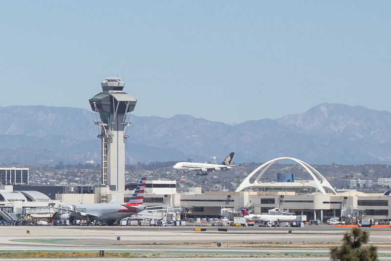
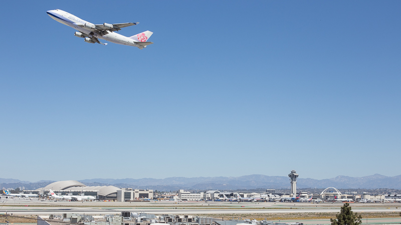
As you can see there were a number of issues to contend with. Heat haze, the changing angle of the sun, and other traffic on the ramp all had to be mitigated. The best way I found to do this was using masks and selections in photoshop to isolate every single plane in the final image and then piece them all together one by one, nudging them slightly so that they all lined up. I took some liberties with the positioning of each of the planes in order to make a more compositionally interesting photo. True aviation geeks may say this is sacrilegious, but it makes for a more interesting and easy to view shot. Everything is still somewhat accurate in terms of pitch angle and takeoff sequences, but like I said, in order to make it 'read,' I had to take some liberties. 

And that's how it was done! PurePhoto, who sells all of my fine art works, has graciously agreed to offer prints of the shot in 18x36", 27x48", and 36x64" sizes on Hahnemuhle archival fine art paper. I have to say, the shot is truly stunning in large format and anyone who appreciates aviation, infrastructure, travel or imagination could easily spend countless hours getting lost in it. To order prints and view availability, click here or head to my galleries on PurePhoto.

Still with me? Here's an interesting aside. At the time of writing this post, this image has received over 350,000 unique hits on reddit, totalling over 110gb in bandwidth. This makes it the most popular aviation-related in image in reddit history! Not bad, for a nerd like me.

Historic Architectural Photography: Photographing a Beverly Hills Architectural Icon

Over the past few months, I've been working with the Beverly Hills Historic Preservation Society to photograph historical or otherwise significant pieces of architecture throughout Beverly Hills in an effort to raise awareness of the city's incredibly diverse architecture and the inherent beauty it contains. I've never been an enormous architectural buff or lover of obscure architecture, but I'd be kidding you if I said I haven't started to appreciate the incredible pieces of architecture that can be found throughout LA. While I don't really subscribe to the current 'Beverly Hills' lifestyle (nor do I think I ever will), to be able to work in and see these locations is really something special and I've often got to pinch myself to make sure that this is really happening.

Many years ago, before the influx of people and massive population growth in the Los Angeles area, these homes were crafted with incredible and often painstaking attention to detail and beauty. It unfortunately seems that the homes built in the area today are rather cookie cutter in comparison, and I must say that I really prefer the Beverly Hills of old, all of these homes so full of character and charm, and I very much enjoy being able to raise awareness and show people that there's a bit more to Beverly Hills than the polished and uppity Beverly Hills that we often hear about. Anyway, that's enough rambling for now.

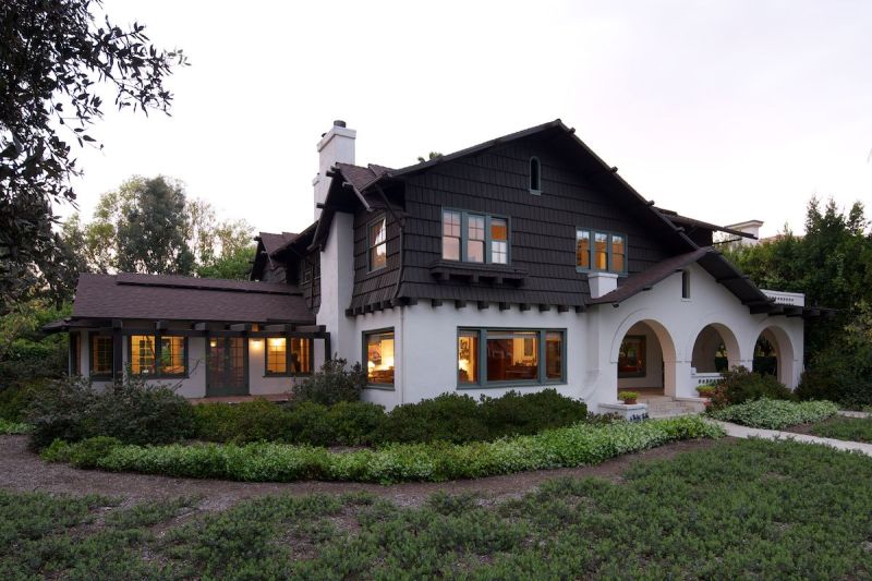
This home in particular is the Locke House, and it lies at the intersection of Rodeo and Lomitas. To celebrate this home's recent inclusion on the list of protected Beverly Hills historic landmarks, a shoot was commissioned and I was so excited to be able to have the opportunity to photograph something so different to what I usually do. It was just a couple of months ago that I was photographing an incredible Greene & Greene home in Pasadena, also of enormous historical signifigance. I'm finding a real affinity for these old homes - there is just nothing like them being built today, and they present a unique series of challenges when it comes to photographing them due to their old layouts and architectural quirks.

Anyway, lets get on to the fun stuff. For this shoot, I used a Manfrotto 3258 for the first time - I think some markets call it a 161MK2B. Whatever it is, I digress, there are a bunch of arbitrary numbers and it's a tripod. It was my first time using this thing - and if you'll notice, it's ABSOLUTELY HUGE! I have been looking for awhile to pick up one of these tripods to get a little bit of elevation in my shots, which is an enormous hurdle to jump. First, I've got to ensure absolutely perfect stillness over the course of hours, which gets exponentially harder the larger the tripod is because the longer legs are susceptible to more torsion and twisting, and the same amount of weight on top of longer legs is easier to move around if they aren't reinforced, and on and on, and something about physics and motion arms that would bore the hell out of you. I wasn't too keen on paying for scissor lifts or Grad-Alls to get elevation, plus they incur a permitting nightmare when you're working in LA, so this tripod seemed to fit the bill perfectly. At maximum extension I can get up to a little over ten feet by my estimating skills. Here's a picture of me on a ladder trying not to hurt myself as I balance up there adjusting settings:

Nerd in the wild!

After I set up the composition and figured out just how to set up this enormity of a tripod, we kicked around and waited for the light to fall so we could add our light and get all of the elements we needed to make the image happen. We were treated to what must have been one of the most spectacular sunsets I've ever seen, which actually just looked TOO good for the final image. I don't want the skies to distract, but rather to add to the image, and while this was simply incredible to witness, it was far too much to use in the final image.

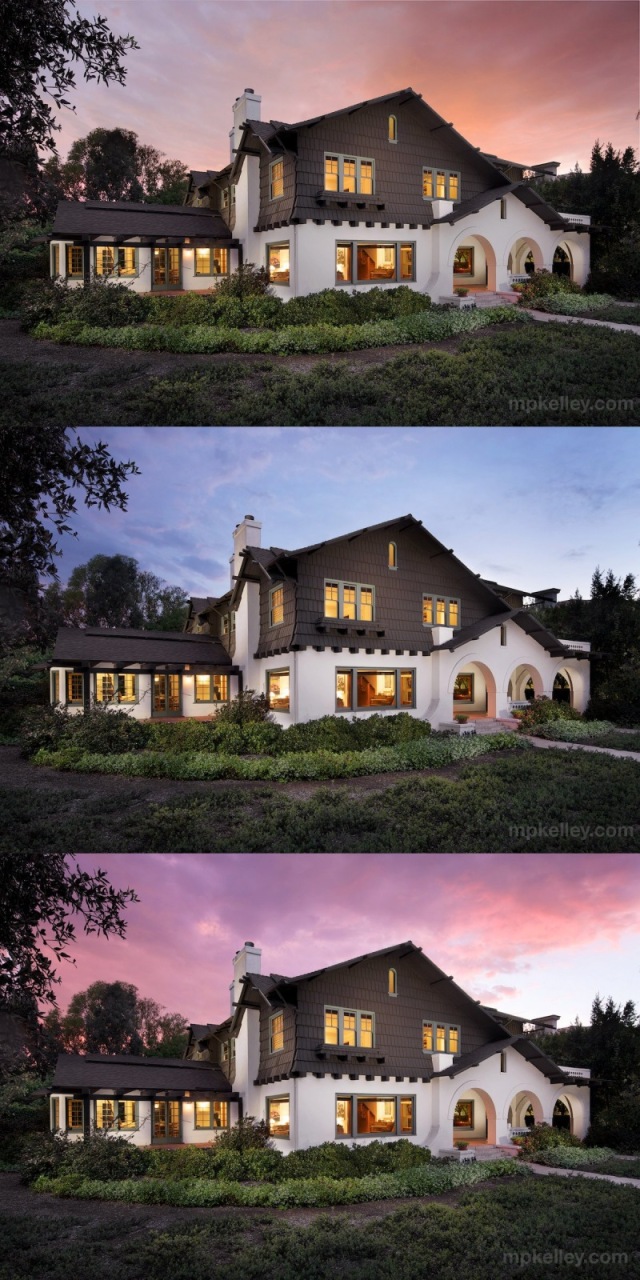
What I ended up using for the final image were some sunsets captured the same night, but in different directions - here you can see how I ended up compositing them and delivering them to the client to pick what she liked best. One of the best parts of creating images the way I do is the amount of control I have over every aspect of an image. Want a different sky? No problem. Different color balance? You got it.

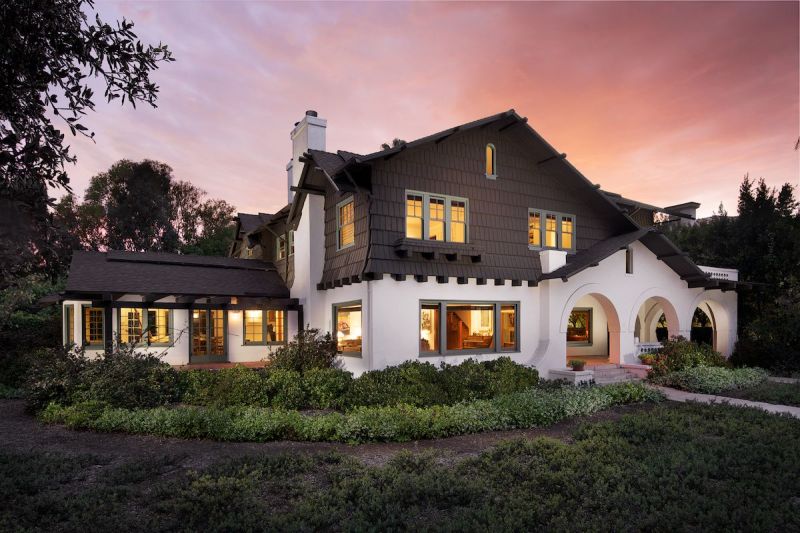
I was perosnally absolutely in love with the top image - it just embodies my personal mantra of 'possible, but unlikely,' striking the perfect balance between an image that is over-edited to the point of being unbelievable, but yet edited enough to instantly grab your attention and let you believe that I captured something that can happen in real life. Here's the final image in all of its glory, which I proudly threw almost immediately into my portfolio.

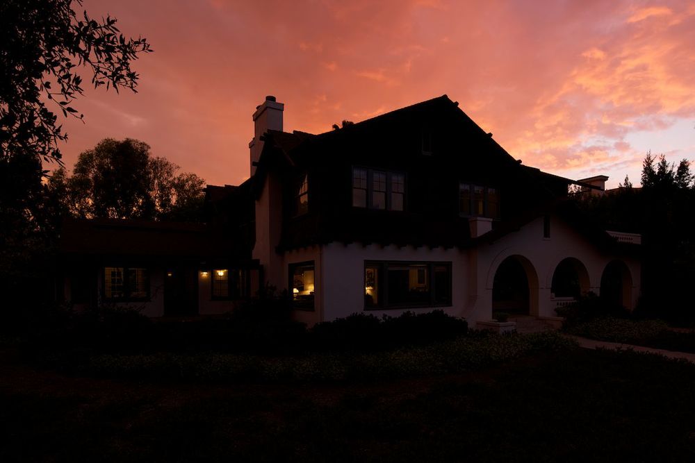
This is quite a departure from our initial test shot, seen below, and a great example of why it takes so long to create one of my images. Three hours on location and eight hours in post were what went into this shot, and I feel it was worth every second. The client got an image that they won't forget, the homeowner was thrilled, and we presented a unique piece of Beverly Hills in an awesome light that will hopefully get people excited about architectural gems like this.