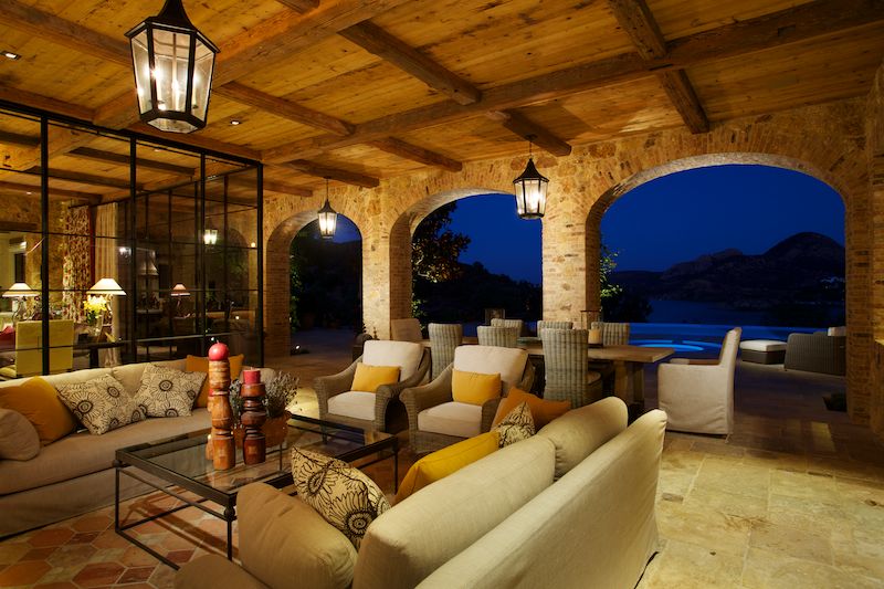
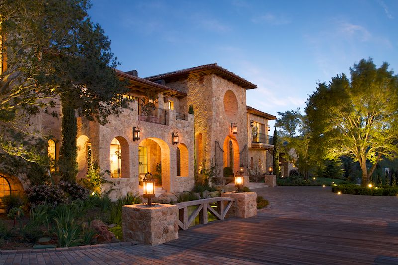
twilight

Architectural Photography in Santa Barbara, CA: Private Residence by VFS Architecture

One of my favorite parts of California is Santa Barbara County, so it is always exciting to get sent on an assignment to shoot a project there. VFS Architects of New York contacted me to shoot a recently completed project for them in Santa Barbara, and I jumped at the chance. Santa Barbara is the definition of 'easy livin' - and it's not hard to see why. This gorgeous home was situated on top of a hill with views over the Pacific and Channel Islands, tucked away above the marine layer. 

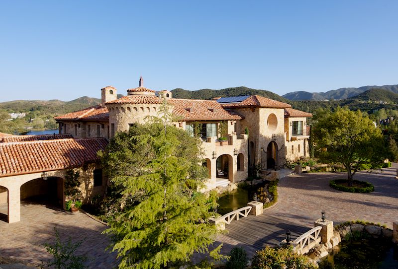
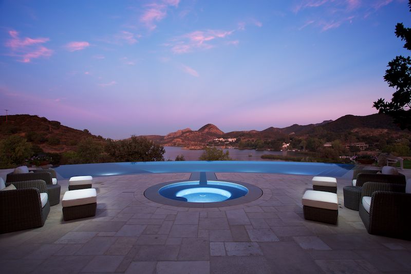
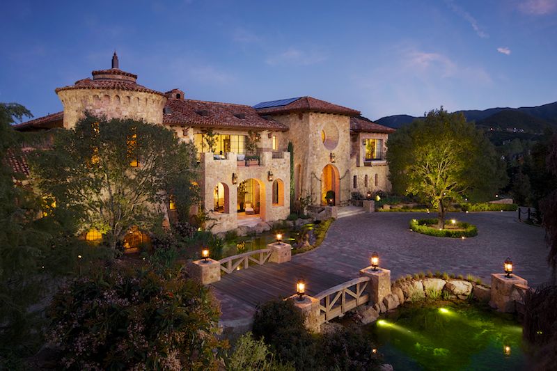
The assignment was relatively simple, in the grand scheme of things, but required a bit of restraint due to client requests. A natural light look was desired, to make the home appear as relaxed and open as possible. While natural light sounds simple enough, there's often a large amount of shaping and refining that light to get it looking as good as it can for the camera. With the twilight shot (above) there was still a considerable amount of exterior lighting at play, from both hot light and strobe, in order to retain detail throughout. Even when applied very lightly, some supplemental lighting can go a long, long way to retain a natural feel and add depth and dimension to architecture.
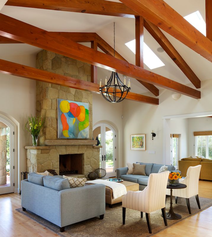
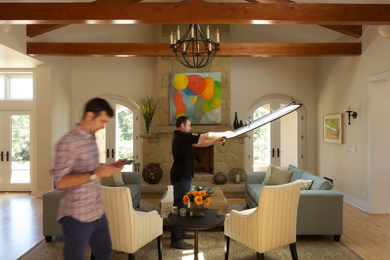
So, even with the requested 'natural light' look, it still took us a full day to produce 8 images. We played quite a bit of a waiting game with the sun, waiting for it to get to just the right spot, and there was (as you can see) some whack-a-mole with the scrims going on to control and soften some of the highlights.
 

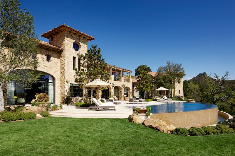
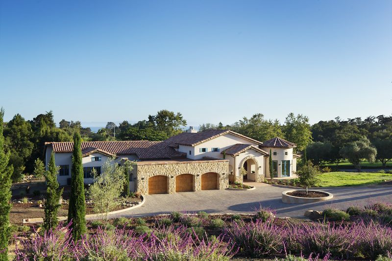
As a side note, while I do love putting together my twilight exterior images, I have to say that I've got quite a soft spot for showing architecture in late afternoon golden light, as seen below. There is just so much depth and texture that can be brought out when the sun is low on the horizon, bathing everything in a warm light. So much can be done to make an image warm, inviting, and dimensional just by waiting for the right light.

I think that this image (below) is my favorite from the shoot. It shows all of the home's significant architecture, the location, the feel, and the expanse of the property, something which is usually at a premium around Los Angeles and Southern California in general.
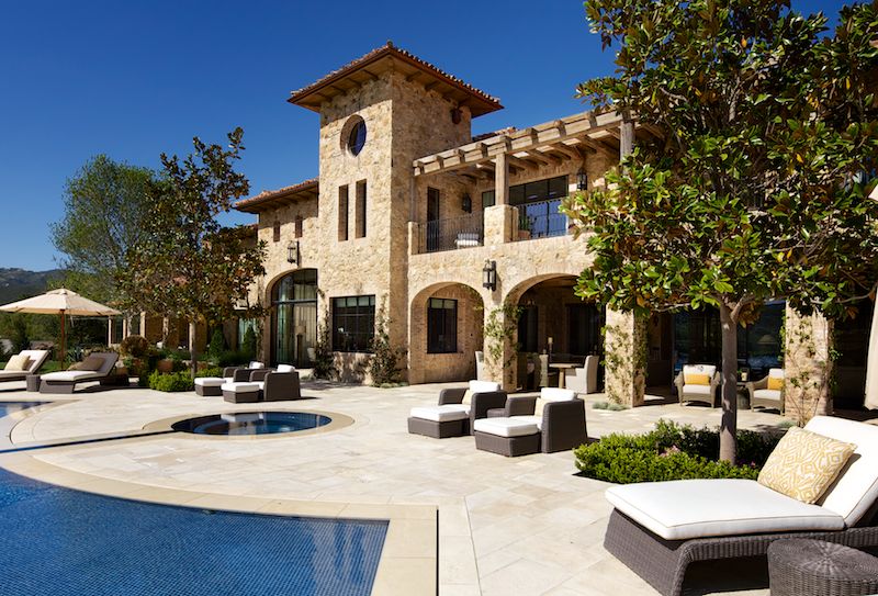
Lastly, a rear elevation shot at about 12' showing the architectural details of the back of the home:
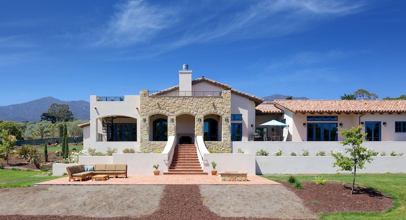
Which is quite a semi-symmetrical feast for the eyes!

 

Photographing The Robb Report 2013 Ultimate Home

About a year ago, I was contacted by a few potential clients who wanted to get together and discuss the possibility of shooting a home still under construction. Of course - it sounded like any run of the mill project and the meeting would be a simple brainstorming session of ideas, finding out what angles and features to shoot, and figuring out the optimal time of day(s) to shoot the home. 

I was incredibly surprised when I drove up to the location and first laid my eyes on the home that we would be shooting. A 26,000 square foot, completely custom Italian/Tuscan villa that sat on top of its own private hill with gated access points and what could best be described as castle walls all around. Simply incredible! I've seent a lot of homes and it takes quite a bit to get a big reaction out of me, but this was unlike anything I'd ever seen. The detail and finish work were exquisite. For example, each of the coppi tiles on the roof were salvaged from Italy, and they were hand made hundreds of years ago by artisans who formed them by pressing them over their legs. 

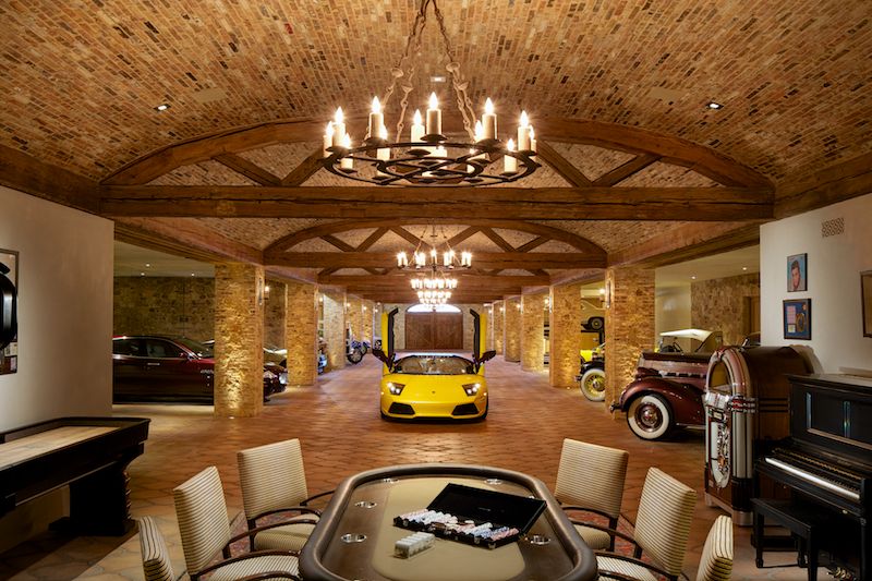
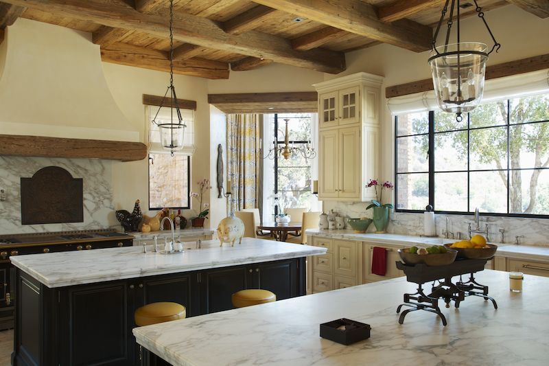
No expense was spared inside, either. The kitchen featured a custom La Cornue range, and the home sported an 8,000 square foot subterranean garage to keep the homeowner's collection in order. Lamborghinis, Ferraris, Teslas, Bentleys, the list goes on, it was all here. There were even a few lifts so that the owner could work on his own cars if he desired. 

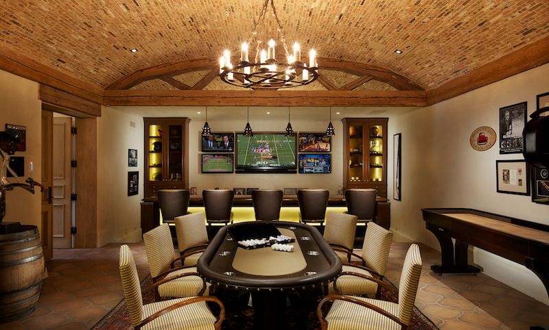
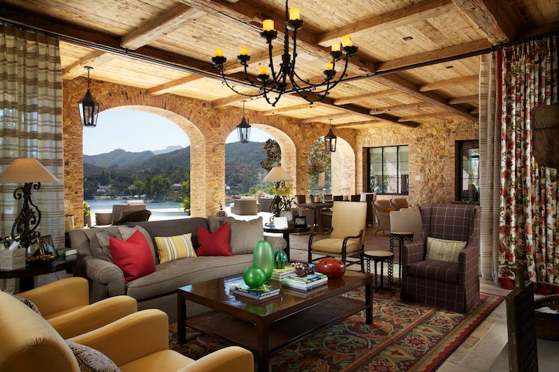
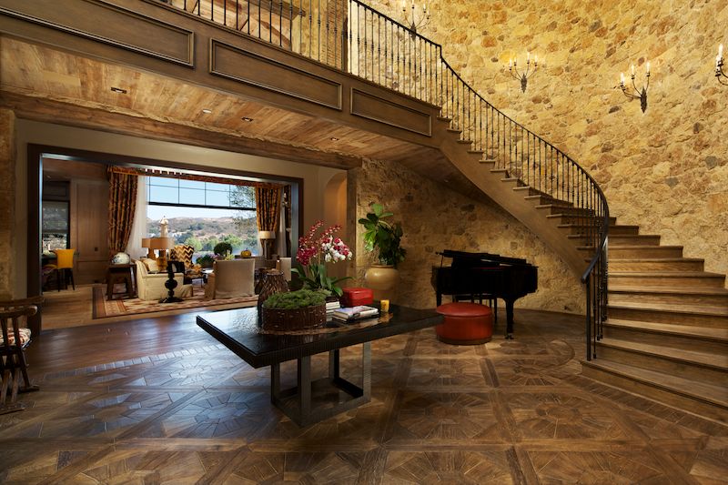
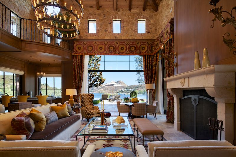
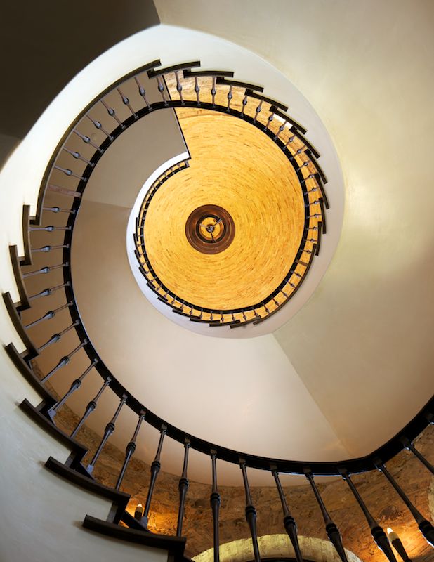
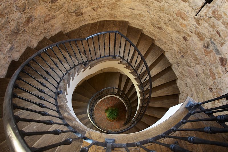
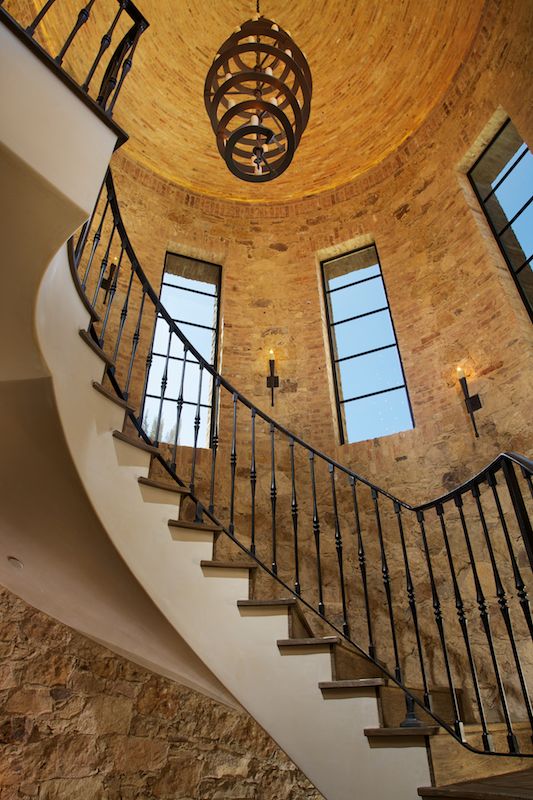
Many of the furnishings and finishings were imported from Europe by the owners when they went on shopping trips, and original old-world artwork adorned the walls. A custom movie theatre with a glass floor looking onto the garage below was a rather interesting touch, as was a spiral staircase spanning three floors with an absolutely incredible handcrafted candelebra at the top. I could sit here for days typing out the things about this house that blew me away, but I'll let you take a look for yourself (above and below).

Photoragraphing this place was a pretty daunting challenge. The dark ceilings and walls sucked up a lot of light, and in order to keep things looking natural, a lot of exposure blending and clever (to me, at least) lighting tricks were employed. I didn't want to overlight the place or give it a sort of casino vibe, so I scaled back some of my usual lighting and retouching processes. There were, however, a few rooms that called for that dramatic lit look, such as the theatre and bar at the end of the garage. 

I think knowing when to light and embellish a space and when to hold back and let it speak for itself is such an important part of architectural photography - there's gotta be a rhyme and reason for doing something, though. If a kitchen has a really great ambient feel with big windows and white surfaces, why kill that mood to make it look like a casino? On the other side of the coin, however, when we're shooting a dark room with lots of mood, why not add some light to bring out the sexiness and feel? It's all subjective, of course, but making the space look as good as it can is what I try to do in every situation. If it looks best light and airy, keep it light and airy, and if it needs some mood, light away! Of course, there are many interiors where there needs to be a happy medium between natural light and artificial light. I'm sure you can tell which photos employed almost all natural light, which employed lots of artificial light, and which were a mixture of both.

When all was said and done, I delivered roughly 50 images of the home shot over the course of three days. The planning aspect of a shoot of this scale can't really be underestimated - early mornings, late nights, and plenty of negotiating 'best times' with the homeowner, clients, and weather made sure that I had my work cut out for me.

If you are interested in reading further about the home or seeing more images of the home, be sure to pick up an April 2013 issue of Robb Report.