Interiors Photography: Sunset Strip Highrise in LA with NYID

While working in Los Angeles, you get to see a very, very wide variety of different architecture and interiors, and every now and then something comes along that you know you'd just never see anywhere else. Such was the case on a recent shoot with NYID, KLEAN, and White Rabbit Partners.  Natalie Younger designed a gorgeous, unique, and jaw-dropping space for KLEAN and White Rabbit and I was excited to have been able to photograph it. 

A soft, inviting, pastel palette at KLEAN was contrasted by an unusual and striking combination of dark wood with grey and black flooring at White Rabbit. Custom made fixtures and furniture throughout created a very interesting setting for these offices.

Photographing the White Rabbit "wing" of the building presented numerous challenges, and it took nearly the entire stable of grip and lighting equipment to pull it off. In order to retain the balance between window views of LA and dark interior, some serious thinking went into composing and lighting. For the darker and moodier shots towards the end of day and at twilight, I ended up using heavily gelled Profoto B1 lights to add warmth to the wood and keep a light brown/red hue in them, and complimented it with bare lowel hot lights to add texture and a little bit of depth here and there. The daylight shots were achieved using just the Profoto B1s, naked on a stand or with an umbrella where appropriate.

Fighting the setting sun on this image was more difficult than the end result makes it look! There were about 2500 watts of light being pumped into this scene when all was said and done.

One of my favorite images from the shoot, above. Lit with a single hot light, it brings the texture of the hand-made cabinetry to life. What's amazing is that cabinet is made from hundreds of individual pyramids of wood which were handmade and arranged randomly, the depth of the piece is just incredible and I tried to bring that out with the lighting.

Lit with a single Lowel GL-1, and one of my favorite recent shots!

Stay tuned for more, I was quite busy right before the Christmas break and have plenty of blogging to catch up on. Looking forward to a new year and some great opportunities coming up!

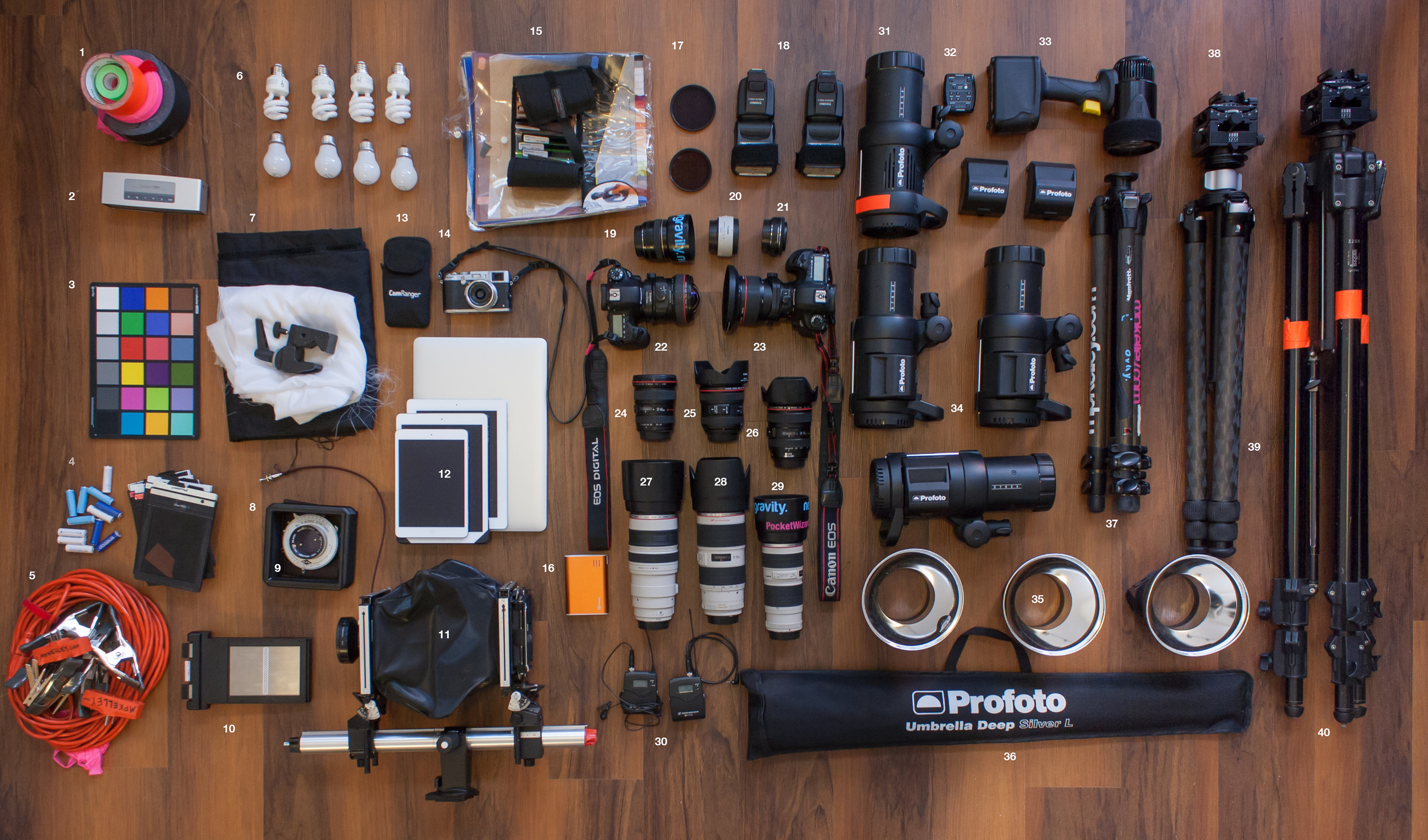
The gear post: What does Michael Kelley use to create his work?

Architectural photography is a haven for gearheads, and I frequently get asked what I'm using. So a few days ago I figured I'd lay it all out and put it to rest once and for all. I rigged up a rather hilarious setup in my living room to shoot this, and took a few hours to lay it all out. Note that due to the limited space, I couldn't put literally EVERYTHING out, so in many cases I refrained from putting duplicates down.  In a few cases, I just have bags and bags of it (grip stuff) and I figured you didn't need to see 5 umbrellas, 8 batteries and 15 CF cards. Click the photo below or click here to head over to the new gear page and see what I'm using.

The list is always changing and evolving, so I will try to keep it updated every few months or so. Maybe in a year I will update the picture, but as it stands, that took a good 3-4 hours out of my day to do! My back didn't love me after it - but hopefully you get some good insight as to what I'm using to create my photos.

Recent press for Michael Kelley Photography

It's been a crazy few months with lots of great new opportunities, so I figured I would round up a few of my favorite bits of press and throw them up on the blog. Very exciting to see my work getting out there and around, and in some notable publications too. Many thanks to the teams at 805 Living, BluHomes, PurePhoto and all of these magazines for being so great to work with and letting me play around with some of the art direction. 

I'm quite a bit humbled and also a bit ecstatic to see my name in some of these bigger publications...always a trip to see your work while waiting in line at the checkstand at nearly every store you go to!

Ventura County From Above: On assignment with 805 Living

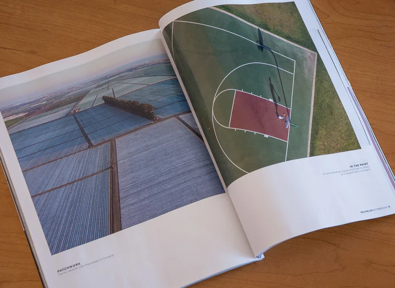
A few months ago I was invited by 805 living to shoot a huge feature for their 10th anniversary issue. Having seen my aerial work of the city of Los Angeles, knowing that Ventura County was just a quick hop north, they asked if I would be willing to give their county the same treatment that I've given Los Angeles with my aerial series. 

You can imagine that I just about jumped off my seat with a resounding "yes!" when that question came up. 

Flying from Camarillo Airport, we'd be flying over nearly all of 805 county - from Westlake Village and Thousand Oaks all the way up to Santa Inez and San Luis Obispo. Working with the guys from Orbic Helicopters (Ken, who has over 17,000 hours of experience...unbelievable) we burned through over 5 hours worth of flight time and came home with some awesome images. While only a small selection made the final cut, I love the edit and think it sums up this corner of California beautifully. I'm very, very excited and humbled that they were able to give me such free reign with the assignment and let me take up so much magazine real estate! For those counting, that's twelve full-page images and the table of contents. Truly awesome to see this in print! It's tough enough to even get a single page, so this picture-heavy story was just fantastic.

They also let me do the writing on this one, so I can tick off the 'write an article for a major publication' box off my bucket list! Two birds, one stone here. A nice way to go.

805 Living was also the first magazine to publish my series of photos on the Malibu BluHome, which led to BluHomes picking up the images for their national advertising (you can see one of the images in the bonus shot I uploaded of the BluHomes ad - first inside page! spread! again!). I owe the 805 Living guys some drinks for that one too. Great to have a magazine show such faith in your work.

To see the full issue and read all of the text, head on over to their digital edition by clicking here.

Los Angeles Prefab: BluHomes in Malibu

I've photographed a lot of things in Los Angeles, heck, and things much further afield. And this was hands down one of the coolest things I've shot. BluHomes, a San Francisco-based company that specializes in prefabricated homes, just completed one of their flagship homes near Malibu and I was given the assignment to photograph it. 

Set in an epic landscape of rolling hills and dark green shrubbery, the setting was serene and the home just fit so well into the landscape that photographing it almost felt like cheating. There were so many great angles, and I wish I had more than just one day to experience and photograph the home. 

Working alongside Courtney Lake of Monogram Decor and Lynne Andujar of 805 Living, we shuffled furniture around, played a few perspective tricks and added just a touch of lighting here and there to make this place come alive via photography.

With such an open and flexible floorplan, the composition options were really endless. Being able to open and shut entire sides of the home to position the camera pretty much anywhere was a dream. I not only loved photographing it, I'd move in here in a snap. 

And we capped the night off with what has to be one of my favorite shots of all time. I think this sums up the house, the landscape, and the architecture so well. Leading lines pull you right in and through, just as the breeze would with all those windows open (this model of house is aptly named 'Breezehouse' after the defining characteristic: two walls of glass that seamlessly slide open to allow a natural breeze to meander through the center of the home. Sublime!)

Happy to say that after a couple weeks of waiting, I discovered that we got the cover image in 805 Living, to boot. Looks pretty good, eh?


The images from this shoot were also picked up and licensed by BluHomes for a two-page spread national ad campaign in the September (and subsequent) issues of Real Simple magazine.


A catchup post: Back in Los Angeles after nearly six weeks abroad

Exhale. That is what I have been trying to do for the past week.

I just had the most incredible, crazy, up-and-down, exhausting month-and-a-half of my life. At the end of May, I had a spate of shoots that just fell into place one after another. At the beginning of June, I was slated to leave Los Angeles for over a month to travel to Israel, Iceland, and the Bahamas for a string of shoots and workshops. 

So I've been going nonstop since about mid-May. And it's absolutely exhilarating and exhausting, hilarious and fun. What a trip!

I'll give you a quick recap, with more detailed posts to come as I get through more images. First, I was off to Tel Aviv, Israel, as an invited guest of Kinetis, to experience and photograph Israel, a country I had honestly never thought too much about. It was just never on my travel radar - and I guess this is what Kinetis aims to fix. They're a non-governmental organization focused on getting artists, opinionmakers, and bloggers into Israel to create, write about, and experience the country. And for some crazy reason they liked me enough to bring me over so I could do my thing, photograph the country, and see what it's all about. And, in short: It was nothing like I ever expected. Just a truly incredible place, full of generous people, beautiful sights and some of THE BEST FOOD I HAVE EVER HAD. Yes, that good. I am by no means a foodie, but I was totally blown away.  I was joined by a few other photographers as well: Adam Lerner, Jared Polin, Rebecca Litchfield, Simon Pollock, and Ben Von Wong, as well as many talented Israeli photographers who really helped make the trip amazing. We saw (and photographed) some amazing sights all throughout Tel Aviv, Jerusalem, and around the Dead Sea. Many more of those pictures and experiences will come in a later writeup and video segment that I'm putting together. For now, here's a shot of a Byzantine Empire-era set of ruins near Ein Gedi on the Dead Sea:

And the courtyard of the Design Museum Holon, which comes from the mind of Ron Arad. Truly incredible stuff.


Of course, this is just a few of many - I just need to find the time to get everything together. I've got a serious amount of material to synthesize from this trip - about 5,000 images total, from which I will piece together all the elements in order to make 20-30 final shots. 

From Tel Aviv, I flew to Reykjavík, Iceland, by way of Copenhagen, to continue work on my Living: Island Style project, which is coming along nicely. I worked with a few of the country's best architects to get access to a number of great locations and the images seem promising as ever. On this trip, I spent a lot of time focusing on the industrial architecture of the country, something I overlooked on the last trip in favor of more residential stuff. Even though I was there in May, the weather was nothing short of crazy. Rain, snow, sleet, sun, hail, and everything in between, on every day. Just completely bonkers. After two weeks in Iceland, driving around the country the exact opposite direction as my last trip, I left with (another) 5000 or so images and way-too-many-gigabytes to get through. I am already incredibly excited about some of the results from that trip - here's a quick preview of the Reykjanesvirkun power plant, a geothermal plant about an hour outside of Reykjavík, set in an absolutely surreal lava field at twilight.

And from Reykjavík, it was off (in the POURING rain, mind you) to the Bahamas. I am always pretty bummed to leave Iceland and its  (seemingly) eternal twilight, but I had a workshop to teach! I was working alongside some of the best photographers in the industry, which is totally a humbling experience. I taught three classes, all focused on interiors and architectural photography, and gave a quick lecture about personal work and all the benefits that come along with it. I had a group of wonderful students for each class and it seems that everyone had a few big takeaways which was great. I opted to teach in a more informal setting, just letting everyone ask questions and letting me demonstrate as I felt appropriate to flesh out concepts. It must have been entertaining enough because every day of the workshop we stayed until well after the technical 'closing time' for classes! We did a bit of everything, from hotel interiors and exteriors, to shooting restaurants and penthouse suites and twilight exteriors. It was definitely one of the most rewarding experiences I've ever had in terms of photography. It was just so great to see so many people so excited about photographing architecture. Once again, I'll do an in-depth wrap up post in the next few days but wanted to just get down on paper some initial thoughts. Here are a few of the shots we made as a group - before and after - showing all the work that went into them. We covered everything from location techniques to post techniques, and hundreds of things in between.

Here are some of the shots from the Bahamas Workshops, created with the help of my wonderful students:

So now I'm back in Los Angeles, and of course, stuffed to the gills with work. Feels good to be back in the swing of things but I really cannot wait to get my paws on the images from Iceland and Israel, and really get some personal work cranking again! In an effort to revive a bit of the creative juices, I've been going up in a helicopter to get some shooting done...here are a few quick shots.


Photographing the historic Sun Theater in St Louis, MO

A few weeks ago I packed up the gear, took a way-too-early flight out of Los Angeles and landed a few hours later in St Louis, where I would be photographing the recently-restored Sun Theater for the St. Louis based architecture firm The Lawrence Group. 

The Sun Theater has a long and storied history - first opened in 1913 as a theater for German-language plays, it went through a number of changes over the years - from playhouse to movie theater to men's club and just about everything in between. Roughly 40 years ago, it was left abandoned as demand declined and other theaters competed. During this time, the building was left exposed to the elements: countless freeze-thaw cycles, a roof that leaked like a sieve, and of course the damage caused by local troublemakers. Pieces began to fall off, walls began to collapse, and nature began to take a toll on the building.

In 2010, a new school was founded near the old Sun Theater. The Grand Center Arts Academy, which caters to grades 6-12, moved into nearby buildings. With a curriculum focused on performance and visual arts, the GCAA had a vision of restoring the theater to its former glory for use as both a performance venue and classrooms. Over the last five years or so, they worked with The Lawrence Group to study the building and assess the feasibility of restoring it. According to Aaron Bunse, the project director at The Lawrence Group, the building's bones and foundation were solid as a rock. The building, he said, was built like a tank, and most of the damage was cosmetic. A restoration was definitely feasible, and in January of 2013 renovations began. After a little more than a year and roughly $11.5m were poured into it, the theater has undergone a major upgrade and the results are simply stunning.

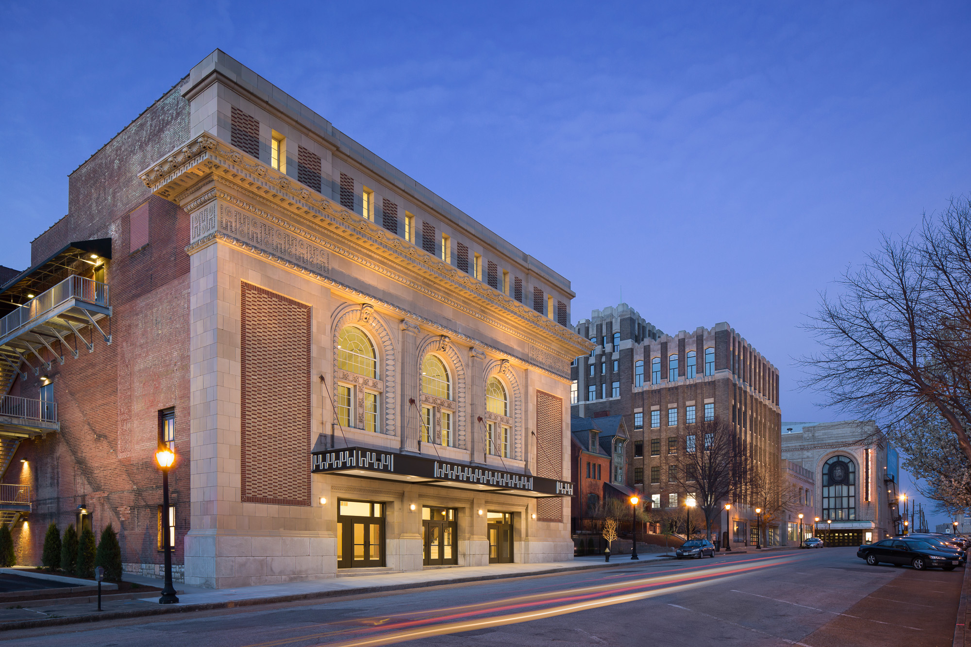
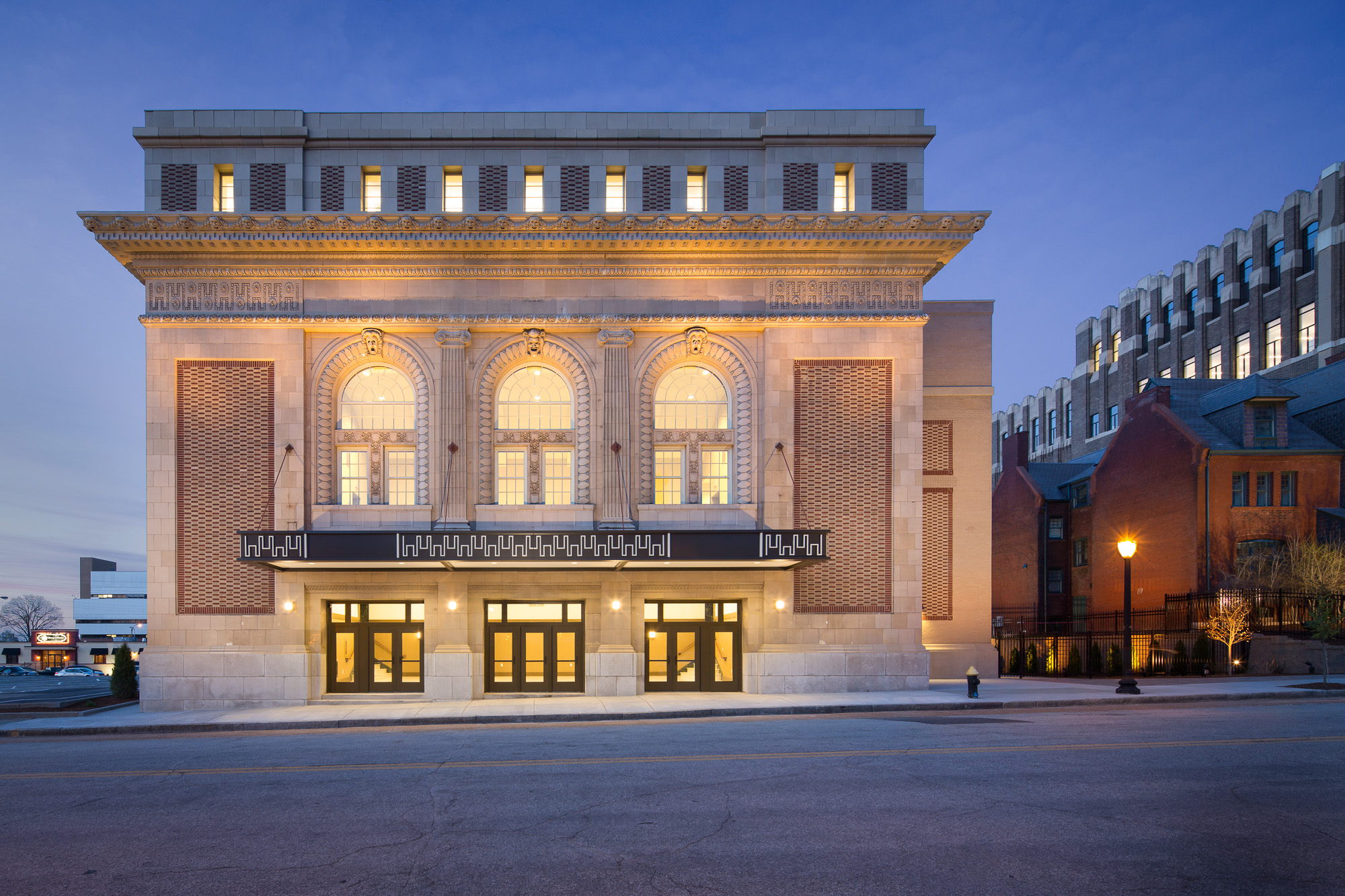
The Lawrence Group hired me to create a series of photographs showing the updated Sun Theater, and over the course of three days (two shoot days and a scouting day) we made seven images: two exterior twilights and five interior photos. Let me be honest, when you walk in this place, it is absolutely breathtaking. I've never seen a theater with such a juxtaposition of modern amenities and early 1900s detail. The restoration that went into this is simply jaw-dropping. Capturing it proved to be both tricky and rewarding. As usual, the biggest challenge was lighting. Switching breakers on and off, adjusting dimmers, adding light and removing light. Every shot took a fair bit of lighting work, which isn't out of the ordinary, but when you're dealing with a space of this size, it sure is exhausting! 

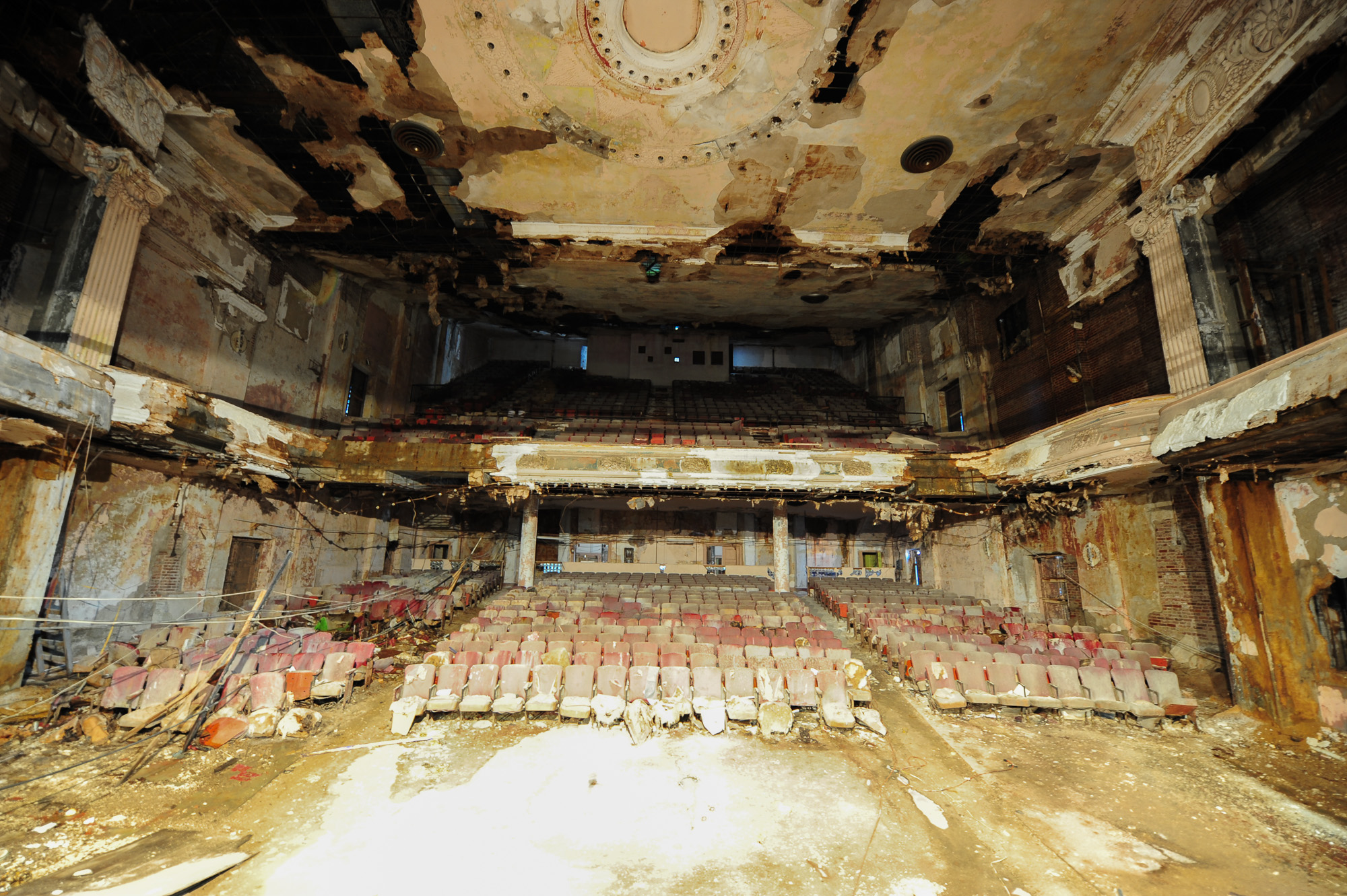
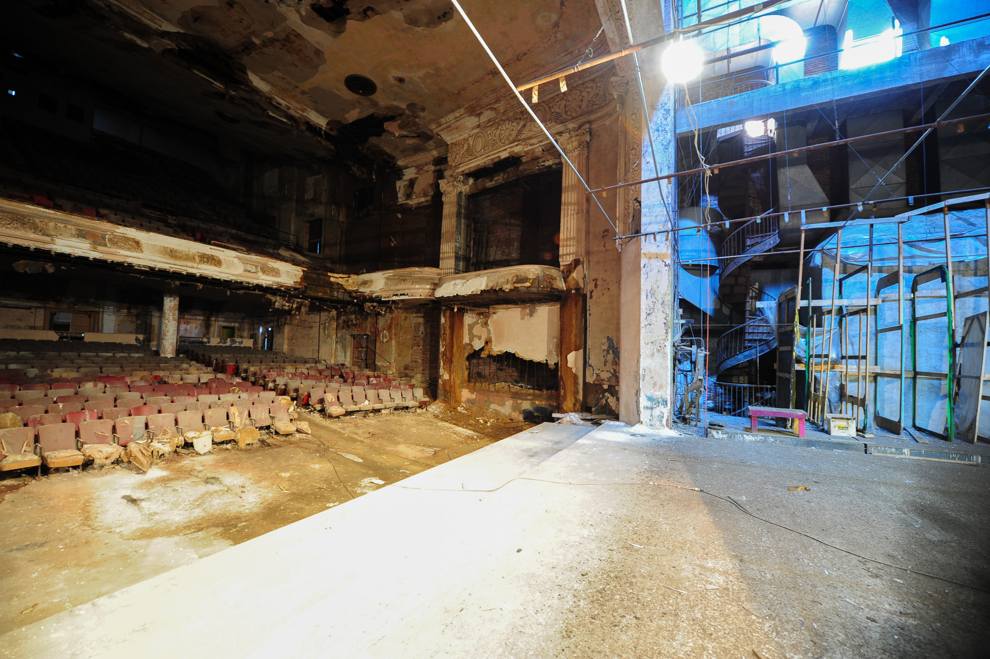
I've gone ahead and with the permission of my client, used a number of their 'before' pictures, so you can see how the theater looked before undergoing restoration compared to my photographs of the finished theater.

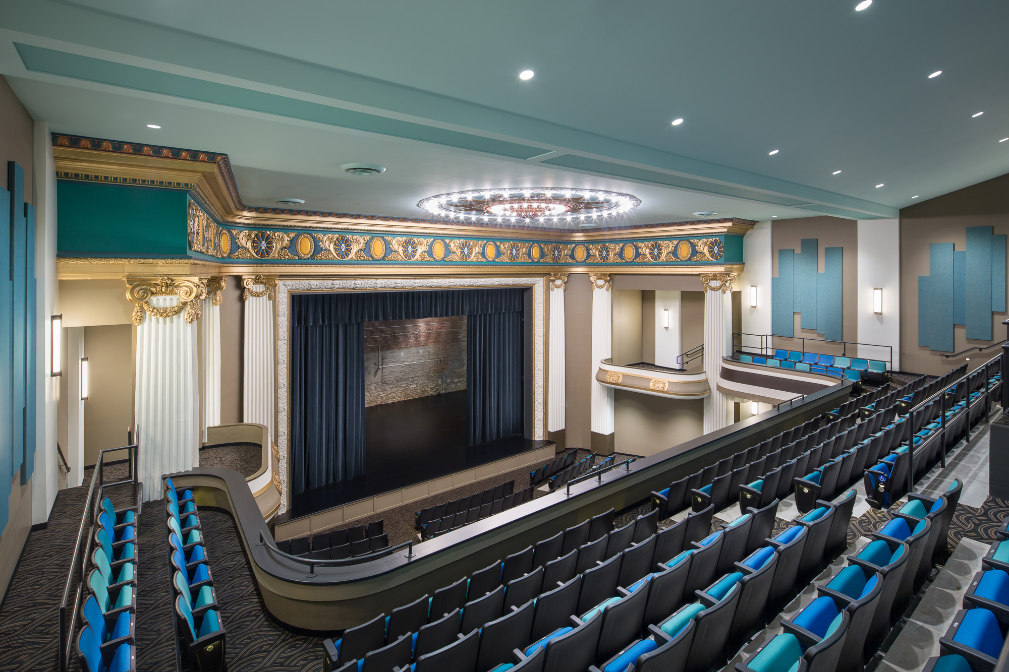
This is the view when you first walk out into the upper balcony area. An enormous stage flanked by a golden proscenium and a striking yet calming blue color palette to contrast it.

Many thanks to Aaron Bunse of The Lawrence Group who graciously let me use the 'before' images, on the left, to compare with my 'post renovation' finished images on the right. You can click each thumbnail to expand the images to a larger size.

Looking across from the balconies, you can begin to appreciate the amount of restoration work that went on here. Much of the plaster work across the proscenium was destroyed over time, and it was all restored by hand using the same methods that were used to install the plaster back in 1912-13.

Standing on the stage, you get to see just what an incredible transformation the place underwent. I'm in love with the colors they chose, as well. I can't imagine being a high school student and walking out to this - nerve wracking! From this angle, you can also see how they redesigned the building. They removed a few hundred seats to add classrooms behind the far rear wall, providing the students with more than just a huge concert hall. There are rehearsal rooms, standard classrooms, and small amphitheater-like rooms for small ensembles to play in.

From the back of the stage, the scale of the building becomes evident. The Sun Theater was built with a huge backstage area, with a flywall tall enough to accommodate multiple stage backdrops and plenty of rigging. 

In the front, the entryway is no less beautiful than the rest. Marble floors and hand-made plaster moulding make for a pretty grand entrance. Much of the smaller details were re-created by The Lawrence Group simply by hand and drawing in details, then brainstorming to figure out how to reproduce it. So much of the plasterwork had been lost to time that in many places, educated guessing was the only way to go.

And outside, the front facade has been impeccably restored. From this angle, you get a sense of the context in which the Sun Theater is placed. To the right, the rest of the Grand Center Arts Academy campus can be seen, as well as the theater scroll for the Powell Symphony Hall, another St Louis mainstay.

After three days of shooting, I was absolutely spent. Once I landed in Los Angeles, I think I slept for a good 12 hours after all was said and done. It was a hell of a job but I am so thrilled with how the images turned out. I can't speak highly enough of The Lawrence Group and their work on this project. It was also an incredible honor for me to be chosen to photograph this job - with so much history and so much excitement riding on the line, for both the people of St Louis and the school kids and staff at the GCAA. I felt really lucky to have been a part of it - and hope that these images can be enjoyed by everyone who helped on the project.

For a great little piece on the Sun Theater and its restoration, check out this Youtube video below:

When all is said and done, I'm absolutely thrilled with this project in every way. It was so great to be a part of this project, even if in just my own little way, and I'm really looking forward to adding these shots to my portfolio. It's been a crazy few weeks here, and it doesn't show any sign of slowing down, so expect a few more posts in the coming days, and many more travel gigs lined up this summer so plenty of meaty blog posts to come.

Announcing the winners of my Bahamas workshop contest!

After receiving about a hundred great entries across a few different platforms, I've finally whittled them down to my two favorites. I've judged a few contests over the last couple of years and this was definitely the hardest decision to make. 

There were some truly interesting comments left on the posts, and I really enjoyed reading why everyone photographs (or wants to photograph) architecture. From business endeavors to the pure love of art and design, there was a little bit of everything.

When deciding on the winners, I actually had to enlist the help of others because I had a hard time removing my biases from the equation, since I've interacted with many of the entrants on some level before, whether through email or my Facebook page. We all agreed that we wanted to give someone a chance who could realistically make it to the workshop, who would be able to use the tools they learned to further their artistic or business proficiencies, and who might not get the opportunity to shoot high-end architecture on a regular basis due to not having access through their job or otherwise.

So, after much deliberation, we settled on a winner. He wrote:

Well, unlike most of the people posting here, I am NOT a professional architectural shooter. I am still assisting. I work at an advertising studio in Milwaukee, WI. I first went to school to study graphic design at the Illinois Institute of Art in Chicago. Fast forward about 6 years and I now have a degree in Photography. I worked full time on 3rd shift while attending school for 8-10 hours a day, 4/5 days a week. All while dealing with the obstacles of being a new father. I've always been drawn to architectural photography because of the design elements. A lot of what I learned in graphic design can be seen in architecture. Things like shape, pattern, line, balance, proportion, contrast, texture, color and so on. I'm naturally drawn to these "principles of design" which is why I enjoy architectural photography so much. I purchased your video and I love it. You take it down to the bare essentials so anyone with a camera and speedlite can get into this realm of photography. I do want to learn more and start putting together a portfolio of interiors and exteriors. Having a steady paycheck is nice. Especially with kids and a mortgage. But I'm just not cut out for the 9-5 job, even though it is in my field. I was freelance for a little over 3 years before I took this position back in October. I loved every minute of it. I believe the time has come for me to step out of the assisting world, and start shooting for myself.

And that was written by none other than Michael Mellon, from Chicago, IL. The entry reminded my of myself in a number of ways - after studying graphic design in college and not really knowing what the hell I wanted to do, I eventually made my way here.

In addition, I chose a runner up in case Michael can't make it. She wrote:

Hi! I am a photography student graduating in December! I started my college career in Interior Design but my love for photography took over. I want to be able to incorporate my two passions into my career and architectural photography has been that for me! I recently started watching your tutorials and reading all I can about it as none of my teachers (while they Are great) do not have much interior and architectural photography experience. To be able to attended this workshop would mean the world to me and give me the edge I need to stand out as a recent graduate.

Which was written by Ashley Pieper from St Louis, MO. I've been exactly where Ashley has, with tons of unanswered questions in a locale that isn't a big architecture haven, so again, her answer resonated with me and the other judges. And Ashley, if Michael does end up making it, I am going to send you a free copy of my 'Where Art Meets Architecture' tutorial so you can learn as much as you can regardless of attending or not.

So that wraps it up. I want to thank everyone who entered, because it gave me a nice little refresher of not only why I want to do what I do, but what it was like when I was first starting out and how fortunate I feel to be able to do this on a daily basis. 

So for Michael and Ashley - shoot me an email through the site or over on my FB page - and I'll get you both set up! Looking forward to the workshop, as we fill up the last remaining spots.


Only three spots left at my upcoming workshop, and I'm giving a spot away to one lucky winner!

As many of you know, I am teaching a couple of workshops at the Atlantis Resort in the Bahamas during the first-ever Fstoppers Workshop. At this point, there are only a few weeks left to register, and in my biggest class, 'The Complete Guide To Architecture and Interiors Photography', there are only three spots left! This is exciting news - I'm really looking forward to meeting all the participants and I have a feeling that it's going to be an incredibly fun workshop since it's been limited size-wise to be very small and intimate. 

One of the epic locations we scouted for the workshop...

One of the epic locations we scouted for the workshop...

Anyway, more to the point - I've teamed up with Fstoppers to add a hold a last minute contest to give away a slot in my two day 'Complete Guide To Architectural Photography' workshop. All you have to do to enter is leave a comment here (by clicking on the post title) or on my Facebook page telling me why you shoot architecture or why you want to shoot architecture. It can make me laugh, make me cry, or just plain 'ol be a story about how it's always something you've wanted to do but never had the opportunity. It's that simple. I'll round up all of the comments, post a few of my favorites, and notify the winner. Yes - it's that simple. Tell me why you want to learn how to photograph architecture or want to refine your skills, and you could win a free pass to the workshop.

Note that the pass doesn't include airfare or hotels - but if you're on the east coast, flights to Nassau are relatively cheap, depending on where you leave from. The rooms start at $169 a night, which is heavily discounted from their normal rates.

If you want to see some of the locations we have access to, check out the video below:

And if you're interested in finding out what an awesome time this is going to be, take a look at the video I  made with Lee, Pat, and Lauren of Fstoppers. We had a freakin' ball down there, and I know it's only going to be better during the workshop. The more the merrier, right?


Photographing Every Departure at LAX's South Complex: "Wake Turbulence"

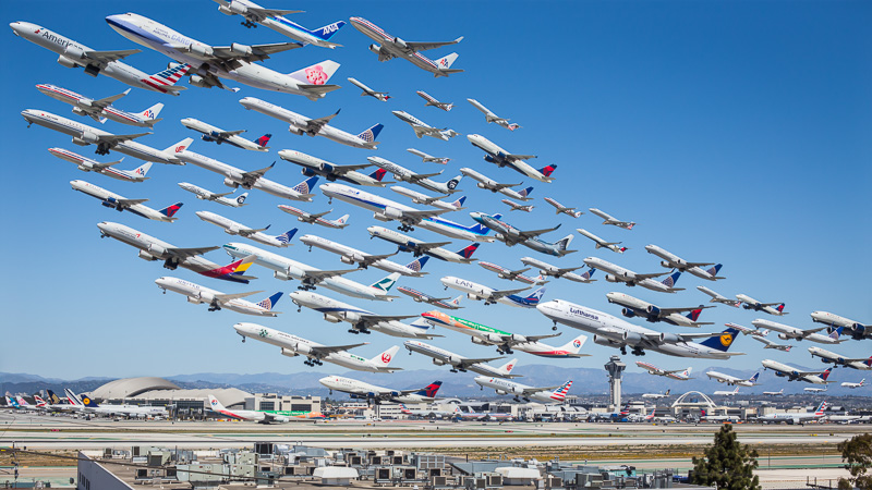
I just spent about 16 hours shooting and putting this image together, and I've written a little blog post, below, detailing some background information and how I did it. While not specifically related to architectural photography, I still find it interesting enough to write and post about, so you'll have to tolerate the tangent this week.

PurePhoto, who sells all of my fine art works, has graciously agreed to offer prints of the shot in 18x36", 27x48", and 36x64" sizes on Hahnemuhle archival fine art paper. I have to say, the shot is truly stunning in large format and anyone who appreciates aviation, infrastructure, travel or imagination could easily spend countless hours getting lost in it. To order prints and view availability, click hereor head to my galleries on PurePhoto.

Los Angeles is a city steeped in aviation history and technology. Over the years, Los Angeles and Southern California have played host to some of the largest aviation companies and activities the world has ever seen. From designing and building Lockheed's top-secret reconnaissance planes to building some of the first large-scale passenger aircraft and having Maverick buzz the tower only a shrot drive south at Mirarmar, aviation is everywhere in this region. Our main airport, Los Angeles International (LAX) is one of the busiest airports in the world and countless airlines use it as a focus city for both international and domestic operations. 

The idea for this photo wasn't some grand thing years in the making, or planned over months. It was simply a clear day in LA and I felt like a total dork sitting inside on the computer. I had to do something. The day before, I was with my friend David Huff at LAX for lunch and some plane-watching, but the smog was out in force so nothing too special happened in terms of photography that day. Since I am generally interested in making photographs that aren't just snapshots of a single moment, I had a thought that it would be interesting if I could seem to capture more than one plane in flight at once. And from there, this idea was born.

This has been done before, yet slightly differently. Ho-Yeol Ryu created a similar piece set at Hannover airport. This showed that what I wanted to do could be done, albeit quite differently. Ryu used planes of all liveries and countries, and took a bit more of an artistic approach in his rendering. My intent was to capture only planes that flew out of LAX - highlighting and emphasizing what an incredible airport that this city has. It's really fascinating to look at all the planes heading in different directions, ferrying people all over the world, all originating from Los Angeles. In this shot alone, there are planes heading to destinations on six continents - either direct or via multi-stop routes on the same flight number. Guangzhou, Auckland, Frankfurt.

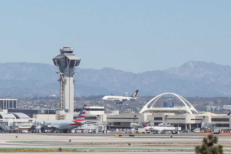
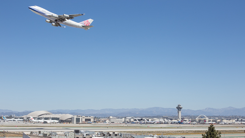
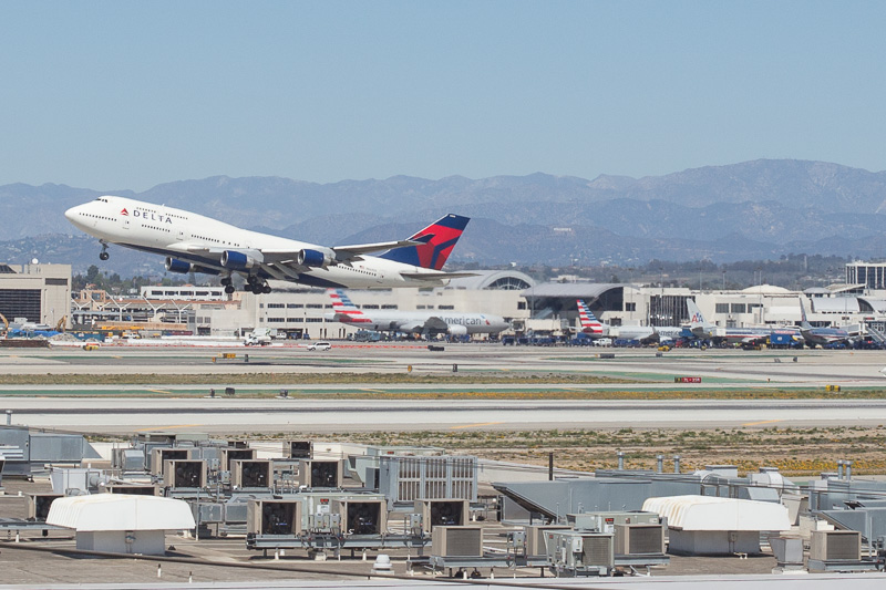
In order to capture the shot, I set up a tripod and photographed every single plane that flew across my frame anywhere from 3 to 10 times. Using sandbags to ensure that the camera didn't move and coming as close to peeing myself as I ever have in my 26 years of existence from not wanting to leave my camera unattended, this resulted in over 400 images from which the composition is built, but not all of them were used. Here are a few of the individual, completely unedited, frames that I used to put the entire thing together, so you can get an idea of how many different frames it took!

As you can see there were a number of issues to contend with. Heat haze, the changing angle of the sun, and other traffic on the ramp all had to be mitigated. The best way I found to do this was using masks and selections in photoshop to isolate every single plane in the final image and then piece them all together one by one, nudging them slightly so that they all lined up. I took some liberties with the positioning of each of the planes in order to make a more compositionally interesting photo. True aviation geeks may say this is sacrilegious, but it makes for a more interesting and easy to view shot. Everything is still somewhat accurate in terms of pitch angle and takeoff sequences, but like I said, in order to make it 'read,' I had to take some liberties. 

And that's how it was done! PurePhoto, who sells all of my fine art works, has graciously agreed to offer prints of the shot in 18x36", 27x48", and 36x64" sizes on Hahnemuhle archival fine art paper. I have to say, the shot is truly stunning in large format and anyone who appreciates aviation, infrastructure, travel or imagination could easily spend countless hours getting lost in it. To order prints and view availability, click here or head to my galleries on PurePhoto.

Still with me? Here's an interesting aside. At the time of writing this post, this image has received over 350,000 unique hits on reddit, totalling over 110gb in bandwidth. This makes it the most popular aviation-related in image in reddit history! Not bad, for a nerd like me.