Back in October, I had the pleasure of working with one of my favorite clients, Kelly Ferm of Ferm Design Concepts and 707 Circle Lane to photograph an office interior she designed for local Orange County startup InsuranceOnline.com. Shot over the course of just a few hours - we had to be quick in order to not interfere with the day-to-day operations of the business, which was full of workers running around and getting things done!
The waiting room, below, lit with hot and strobe light brought out the softness in the wood and smoothly curved white armchairs. By adding shadow and highlight we were able to add plenty of depth and interest in a room lit with only overhead can fluorescents for practicals. I strive to take places like this - with interesting interior design, yet fairly standard overhead office lighting - and transform them into a soft, inviting, and flattering image that presents my clients' work better than any snapshot could.

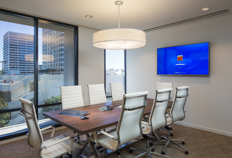
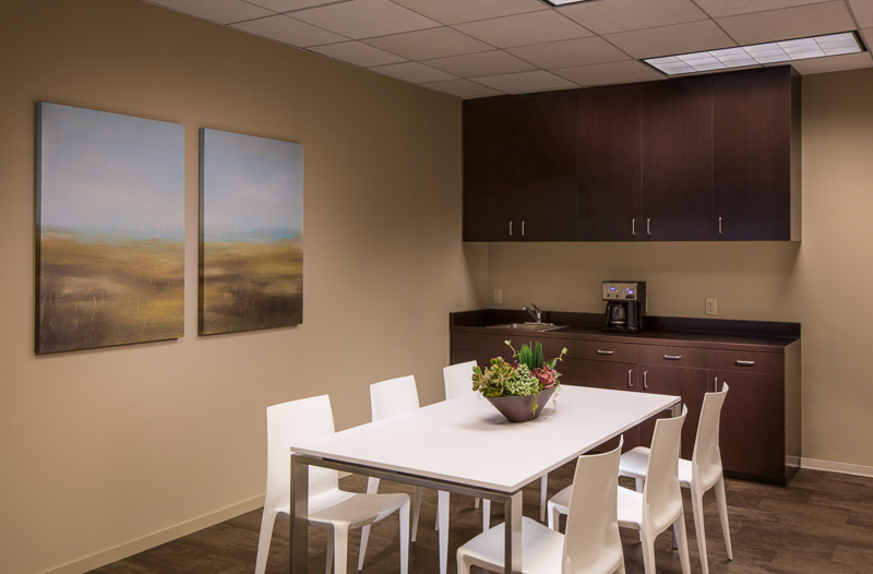
Up next, a simple conference room and break room - but bringing softness and richness to the design is a bit tricky when dealing with just ovehead fluoros. The camera doesn't quite see what the eye does, so plenty of massaging with light is necessary. Those conference room windows were heavily tinted blue, and required some serious gelling of the lights to make it all match.


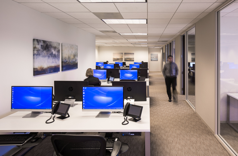
And lastly, my favorite shot from the day, and a very impromptu one at that, shot as most of the workers were at lunch. I saw this angle upon walking in and wanted to shoot it, but pulling it off would be tough. We only had about 20 minutes or so to clean, organize, stage, and light the space, which of course was tricky. Working with an assistant, we hid everything we could, arrange the desks and computers as best as possible, had a few workers stand in for models to give some life and activity, threw a couple lights up, mostly in a seat-of-the-pants fashion, and let it ride. What resulted is one of my favorite shots in recent memory. Even a simple office interior can photograph incredibly well if the architecture lends itself to it.

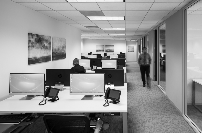
And this shot, as it turns out, lent itself to a very nice black and white conversion, which I find quite reminiscent of a few shots of Julius Shulman's. A classic, contrasty one point perspective which draws the eye in and lets you linger. Thanks, Kelly, for the great subject and chance to make some killer photos!

You'll have to excuse my lack of blogging lately, as I have been busier than ever and all over the west coast photographing (nearly 4,000 miles driven in the last two months alone) a number of different projects. Expect a lot more posts as this cools down and the holidays come up.
