interiors photography

Photographing Fig House: Los Angeles' Coolest New Event Space

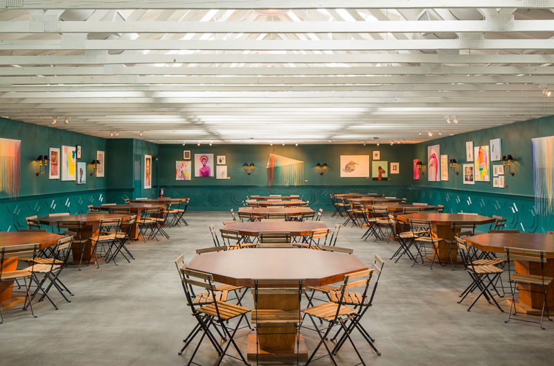
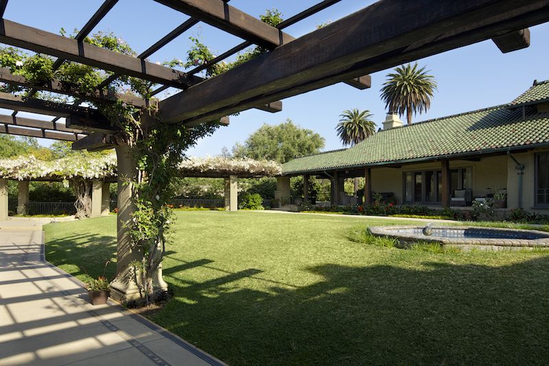
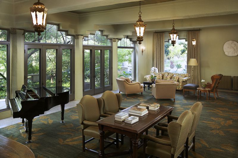
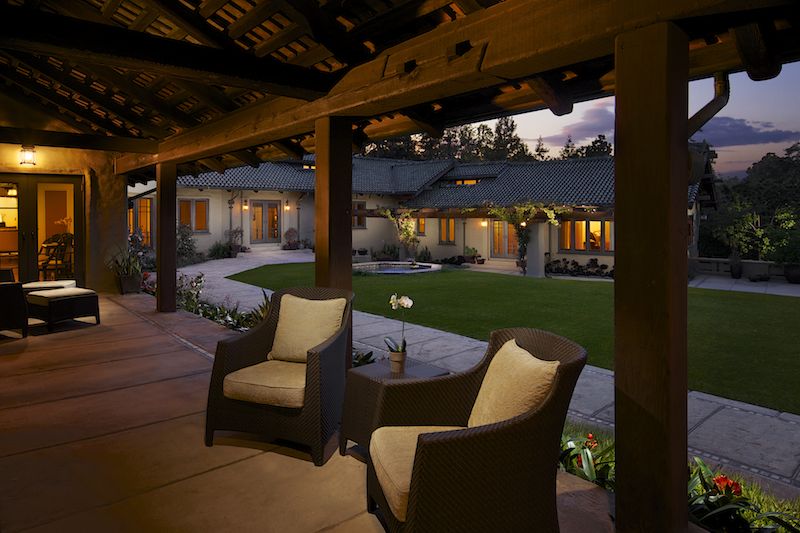
It's true: I get to see some seriously cool locations. One of my favorites has to be the recently completed Fig House in Los Angeles. Located in Highland Park, Fig House touts itself as a bespoke events venue, catering to a wide range of clients; they do everything from weddings to corporate parties to photoshoots and everything in between. Fig House is exciting and fresh, and a definite change of pace from what I usually shoot. With an eclectic mix of styles (everything from 1920s Hollywood to art deco with modern LA touches) it was a nice challenge to capture it all. I absolutely loved all of the color and variation throughout the space. 
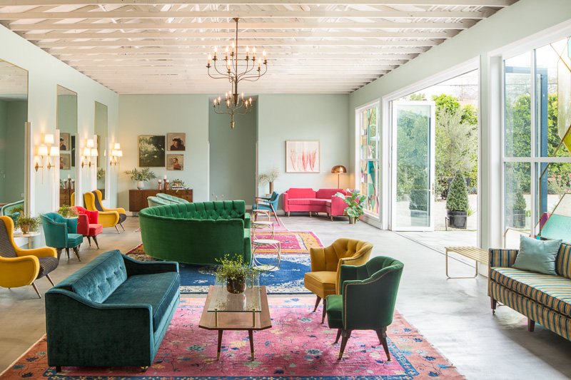

I opted to shoot this in a more natural light style - this place just came alive with color owing to the huge sliding glass door windows emblazoned with stained glass by Judson Studios. Since the design was full of color and a mix of styles, adding a ton of light wasn't going to do any favors: it would only make the scene busier. I'm all about lighting to the space - and what that space calls for in terms of photography in order to make it look the best that it can.  No need to reinvent the wheel if you don't have to, right?
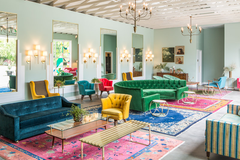
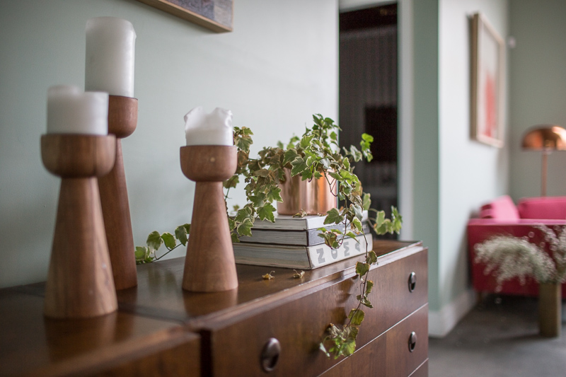
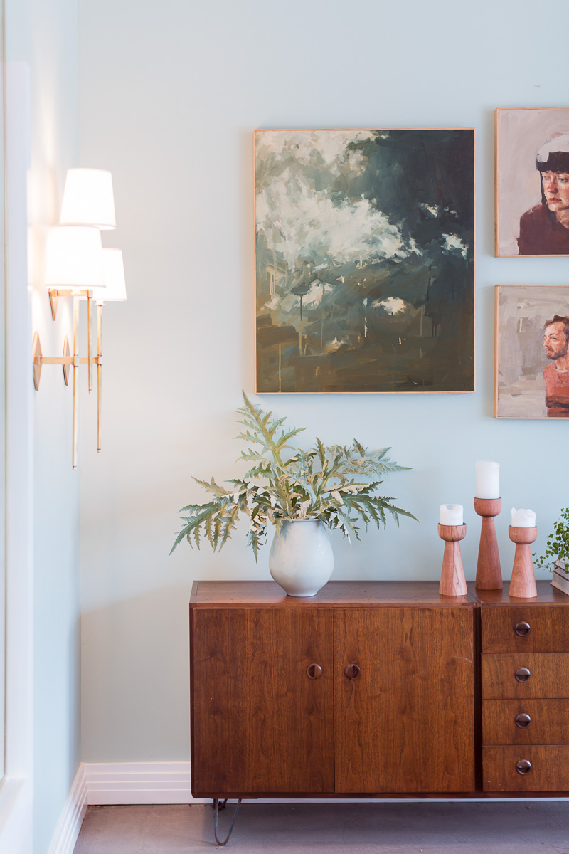
Next door to Fig House is Roomforty, a catering and restaurant service with a charm all it's own. While this was merely an accesory to the Fig House shoot, I absolutely loved the decoration and design of the tasting room, where potential clients can get a taste of the food made right on site or friends can gather to have a private meal of their own during a function at Fig House. 
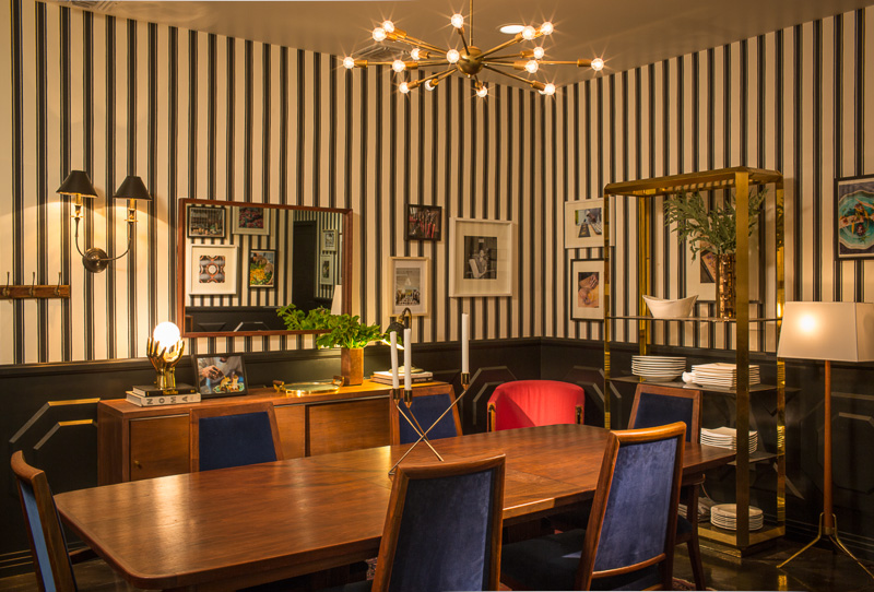
 

And of course, what blog post would be complete without mentioning the perks of being an architectural photograhper? Roomforty's food, as expected, was absolutely jaw-droppingly delicious.


Photographing a Modern Office Interior in Orange County: Ferm Design Concepts

Back in October, I had the pleasure of working with one of my favorite clients, Kelly Ferm of Ferm Design Concepts and 707 Circle Lane to photograph an office interior she designed for local Orange County startup InsuranceOnline.com. Shot over the course of just a few hours - we had to be quick in order to not interfere with the day-to-day operations of the business, which was full of workers running around and getting things done! 

The waiting room, below, lit with hot and strobe light brought out the softness in the wood and smoothly curved white armchairs. By adding shadow and highlight we were able to add plenty of depth and interest in a room lit with only overhead can fluorescents for practicals. I strive to take places like this - with interesting interior design, yet fairly standard overhead office lighting - and transform them into a soft, inviting, and flattering image that presents my clients' work better than any snapshot could.
 

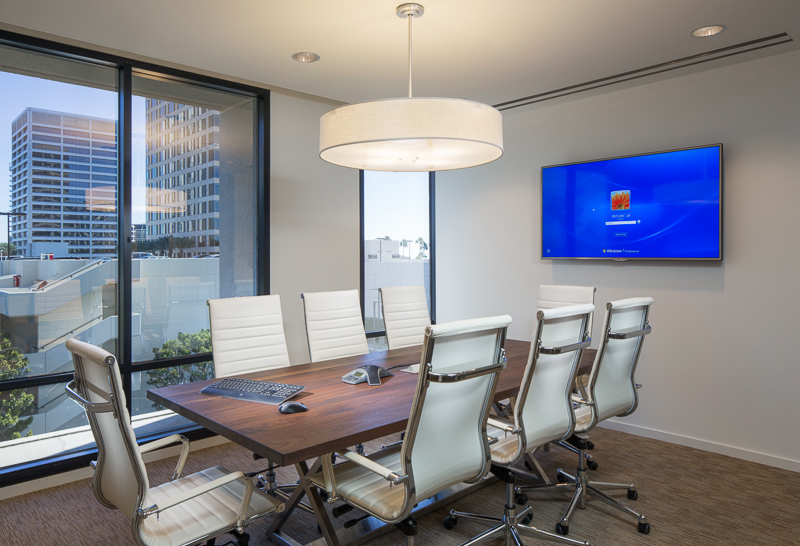
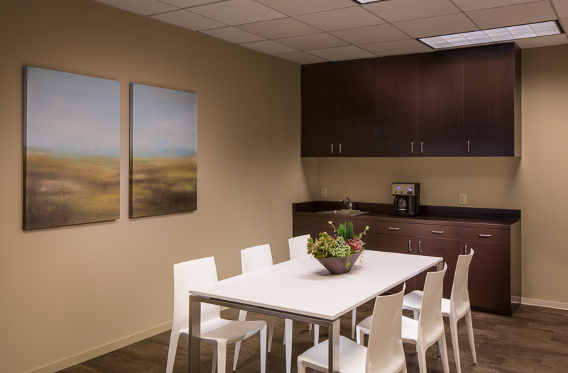
Up next, a simple conference room and break room - but bringing softness and richness to the design is a bit tricky when dealing with just ovehead fluoros. The camera doesn't quite see what the eye does, so plenty of massaging with light is necessary. Those conference room windows were heavily tinted blue, and required some serious gelling of the lights to make it all match. 

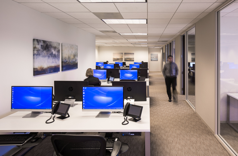
And lastly, my favorite shot from the day, and a very impromptu one at that, shot as most of the workers were at lunch. I saw this angle upon walking in and wanted to shoot it, but pulling it off would be tough. We only had about 20 minutes or so to clean, organize, stage, and light the space, which of course was tricky. Working with an assistant, we hid everything we could, arrange the desks and computers as best as possible, had a few workers stand in for models to give some life and activity, threw a couple lights up, mostly in a seat-of-the-pants fashion, and let it ride. What resulted is one of my favorite shots in recent memory. Even a simple office interior can photograph incredibly well if the architecture lends itself to it. 


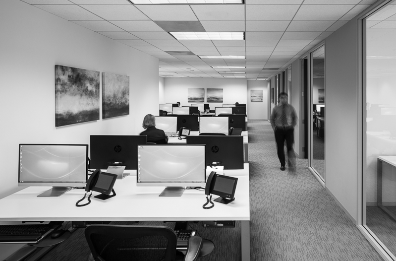
And this shot, as it turns out, lent itself to a very nice black and white conversion, which I find quite reminiscent of a few shots of Julius Shulman's. A classic, contrasty one point perspective which draws the eye in and lets you linger. Thanks, Kelly, for the great subject and chance to make some killer photos!


You'll have to excuse my lack of blogging lately, as I have been busier than ever and all over the west coast photographing (nearly 4,000 miles driven in the last two months alone) a number of different projects. Expect a lot more posts as this cools down and the holidays come up.


Architectural Photography: Photographing Wrath Winery in Soledad, CA

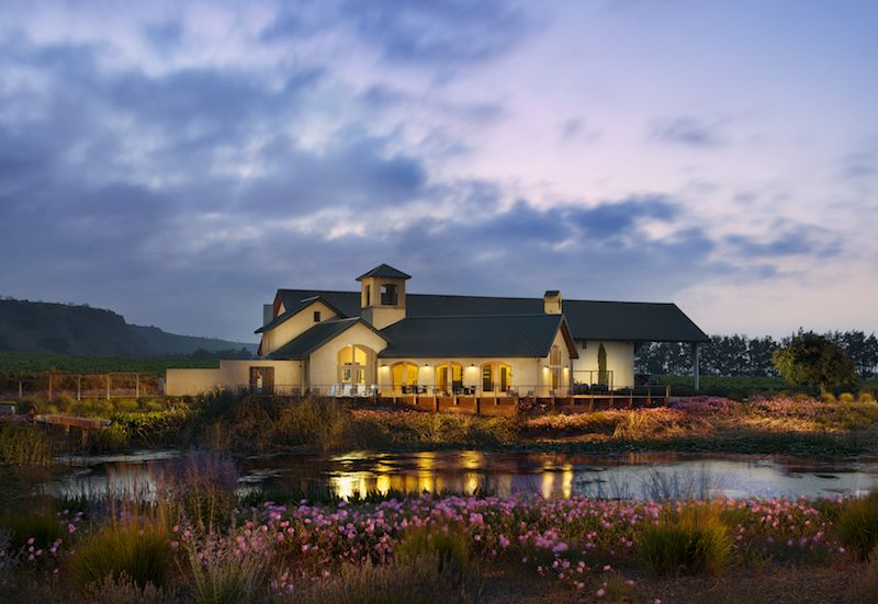
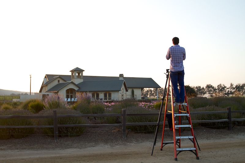
Seems that these days a larger and larger percentage of my photography is taking place outside of Los Angeles, and I'm totally loving all of the new locations I'm getting to see on my travels. In addition to the Hahn Winery (seen in the below post) which I photographed, I also shot the Wrath Winery, also located in Soledad, CA, for a revamp of their marketing materials. Wrath is situated in the gorgeous Salinas valley, which makes for some very interesting lighting and fog effects at sunset. As the cool air from the Monterey Bay moves inland, it meets the warm air from the eastern side of the valley and condenses, creating a fog which rolls rapidly up the valley towards the vineyards we were in. While this caused me a bit of trouble while photographing Hahn, it made for a beautiful twilight down in the valley at Wrath. The clouds added great atmospherics and really let me play up the name of the winery - I felt like I could really push it with the processing on this, given the name, location, and lighting effects. 


This was lit with a combination of strobe and hot light - actually, scratch that - warm light - a Lowel GL-1, which doesn't really get hot like a traditional hot light, and is thus ten times easier to use for my style of photography. I've got the burn marks on my hands from regular hot lights to prove it. In addition to the GL-1, we had a series of PocketWizards set up in relay mode to help cover the enourmous distance between myself and the building. Due to the pond in front of me eating the radio signal, it took two or three PocketWizards to make it over there, but we finally got the system working flawlessly.

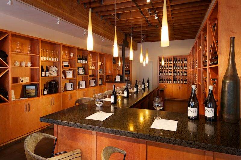
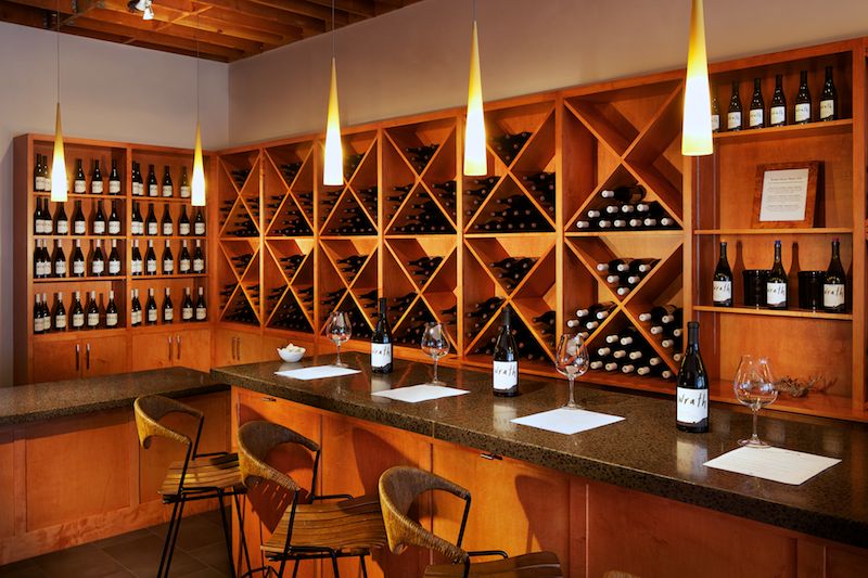
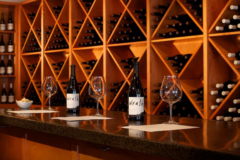
The interiors of the tasting room, which is located in downtown Carmel, were lit entirely with the Lowel GL-1 - I am beginning to love this light more and more everytime I use it, as it has replaced speedlights and inkies in a number of applications for me. I kept the GL-1 bare with no gel in an effort to bring out some of the richness and color in the natural wood interior. I just love the warm quality of light that we created throughout.

It took about 2.5 hours to create the three interior photographs - which was made tricky as a result of the tasting room being open for business, even though it was about 11am on a Monday. Thankfully, everyone was wonderfully accomodating and we even had a few people stop by to spectate and observe what was going on. Seems Carmel attracts a fair amount of hobbyist photographers who were keen to see the shoot in action.

All in all, this was one of my favorite shoots in recent memory. It's not often you get to set up a tripod in vineyards, enjoy an amazing sunset, taste plenty of great wine, and come home with four portfolio-quality photographs. Jobs like this are a reminder of why I love what I do!

Interiors Photography: Using Artificial Light To Create Mood And Remove Color Casts

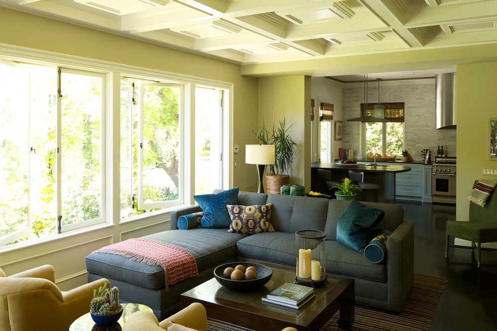
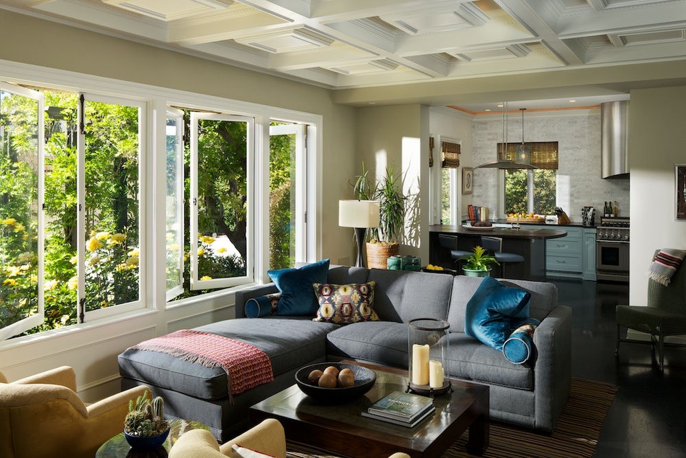
Here is an example of what artificial light can do for an interior photo. While there are many instances where natural light may be all you need, this is a relatively common scenario that I see interior shooters struggling with on a regular basis. 

If you look at the natural light photo, it may look okay at first glance. It's a beautifully appointed, well-staged room, and the composition is as good as it can get owing to obstacles out of the frame blocking any other compositions.
 

But then take a look at the image (below) where I used a healthy dose of artificial light. The true colors of the room immediately come out - the paint no longer has a sickly green cast from the grass outside, the furnishings are their intended colors, and the contrast of the room has improved ten fold. Not to mention the feel that artificial light is able to create - there would be no way to create this Sunday-morning feel using only natural light. HDR would yield a muddy mess, especially in such a high contrast situation, and attempting to use only a single exposure would be a disaster, as illustrated above.
 

So not only does artificial light create a room with correct colors and contrast, but it also lets us entirely change the mood of the photo - something that natural light alone would never allow us to do. And isn't that our job as photographers? To make a space look as good as possible? To want the viewer to say - 'I want that - to be there, soaking up that sun with my coffee and paper!' One of the best things an interior photographer can do for his or herself would be to master not only available light photography, but also to learn how to create emotion via the use of artificial light.


Photographing An Architecturally Significant Home: Pasadena Greene & Greene Built in 1911

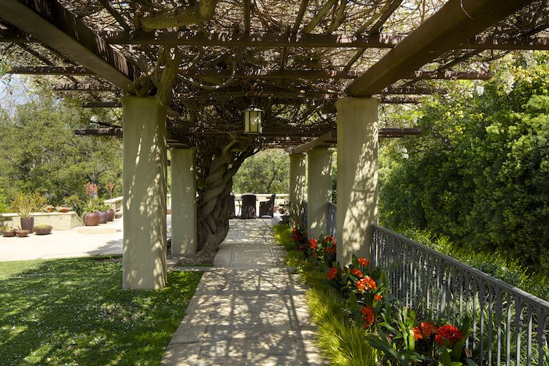
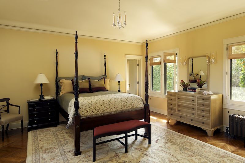
I was recently awarded an incredible opportunity: photographing a Greene & Greene home in Pasadena that had been immaculately restored and maintained. I was contacted by designer Christine Kilian (who, notably, was a major force behind the architecture and design of the renowned Getty Museum), who wanted to document the home which contained her work. In addition, the owners were interested in having photos taken as keepsakes to remember their hard work and tireless devotion to restoration.

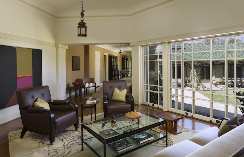
Built in 1911 by the famed brothers Charles Sumner Greene and Henry Mather Greene for three sisters from Illinois (Cordelia, Kate and Margaret Culbertson), it had cost $100,000 at the time: the equivalent of more than $2.5 million today. The home is a stunning piece of work, yet markedly different than most of the Greene & Green homes that are scattered throughout Pasadena. Instead of large, bulky, shingle-clad and relatively symmetrical designs, The Culbertson house is covered in a light tan gunite. It has a low facade, somehow resembling a Chinese temple, and a roof of glistening green tile, dashed with red flecks that reflect a varied spectrum depending on the time of day. The home is quirky in its layout; a large, yet asymmetrical U when viewed from above that gently slopes down towards private gardens with views of the mountain ranges behind Pasadena.

This was certainly unlike most homes that I've photographed, as I have spent most of my time photographing new constructions and remodels. Homes dating to 1911 in the area are exceedingly rare (this is where I also mention how jealous I am of all you shooters on the east coast, where a 300 year old home is nothing out of the ordinary), and in many cases owners update them to reflect current trends and tastes.

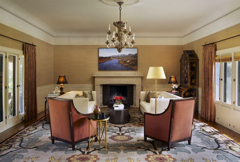
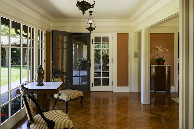
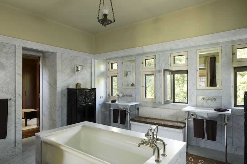
In order to maintain the feel and mood of the home, I used a lighting approach that maintained a natural look, yet also allowed for the richness and depth of the colors and textures to show in the photographs. In a home such as this, I felt it was absolutely necessary to preserve the mood and ambience of the interior. Careful attention was paid to composition and staging, and in many cases we spent over an hour perfecting furniture layouts and lighting schemes.

Some of the lighting situations from a photography persepctive were somewhat nightmarish. A number of one-point perspective compositions meant some creative light placement was necessary. Cavernous areas covered in dark paints required careful attention when aiming and positioning lights not only to avoid color casts but also to avoid reflections and maintain the natural feel. It's very easy to overlight a big space where such a wide dynamic range is present.

Despite these challenges and the all-day shoot (nearly 12 hours for 12 staged and lit images), everyone involved was thrilled with the outcome. I hope the extra time we put into staging and preparing the space shows, and I know that these images will be used for years to come by everyone involved. Creating timeless images takes time, but I hope you'll agree that the results are worth it!


Santa Monica Contemporary Interior

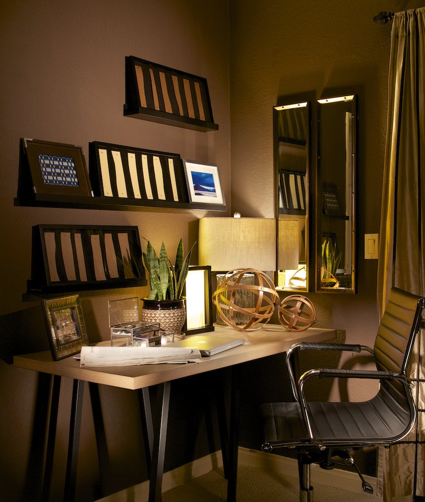
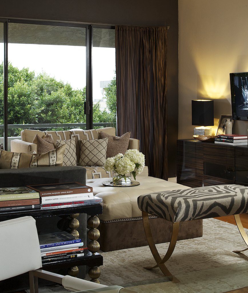
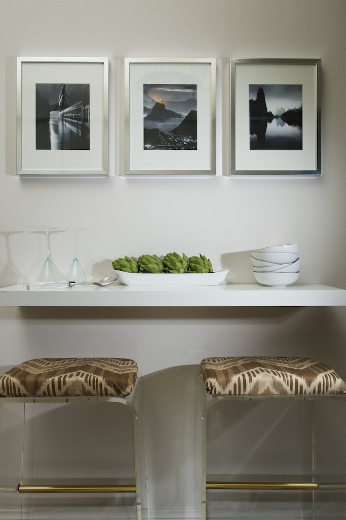
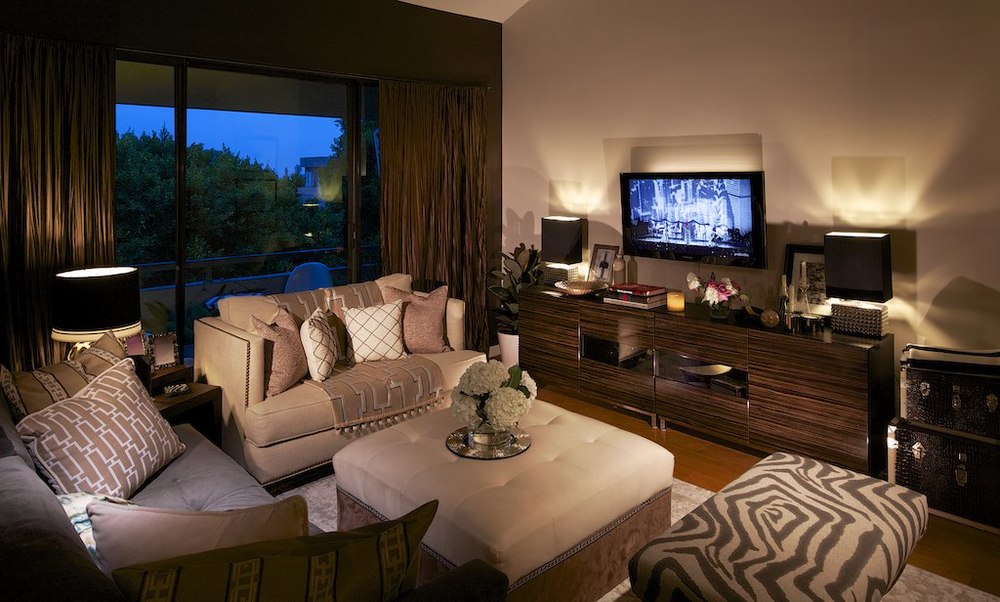
Shooting for the wonderful Natalie Younger Interiors, we spent a couple of days photographing this space in Santa Monica. While small compared to some of the homes I shoot, I absolutely loved the varying patterns and rhythms found throughout. I could move into that office starting tomorrow, it just drips personality and character. This just goes to show how dramatically a talented designer can transform a normal run of the mill space into something that suits the owner's style and personality. This was so fun to photograph, such a contrast from many of the things that I normally work with.


Architectural Photography In Iceland: Michael Kelley Featured On Strobist.com

Strobist.com, which is one of the world's leading photographic resources, recently featured a piece on my 'Living: Island Style' project, in which I set out to photograph the architecure of Iceland during a three-week whirlwind trip around the country. The article discusses my motivation, how I pulled it all off, and how it might inspire other photographers to undertake a personal project of their own to further their career and kickstart their creative growth. I'm really happy with the way David Hobby, the author, wrote the piece, and I have received numerous emails thanking me for inspiring them with my trip. When I left Los Angeles, nobody really had any idea what I was talking about when I told them I was going to photograph architecture on a remote island in the North Atlantic. "You're going where? To do what? Why?" was the most common response. Check out the article, I'd love to know what you think, and I hope you are inspired to take on a project of your own after reading it. If you ended up here from Strobist, thanks so much for visiting, and I hope you enjoy the work on my site.

Keep an eye out for the finished 'Living: Island Style' project, which is slated to be finished by the end of the year.

To read the article on Strobist, click here.

Photographing An Architecturally Significant Home In Beverly Hills Designed By Paul R. Williams

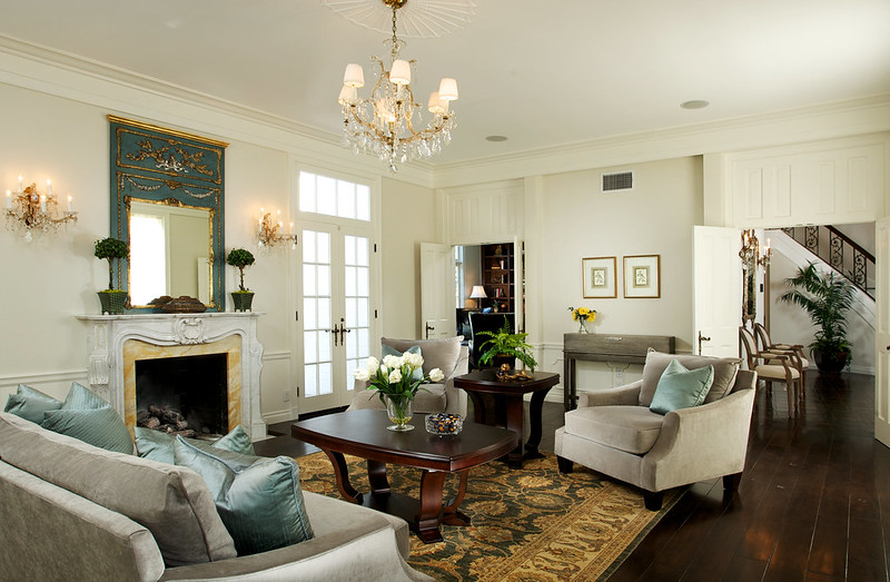
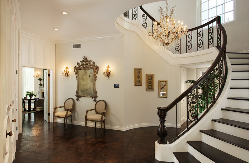
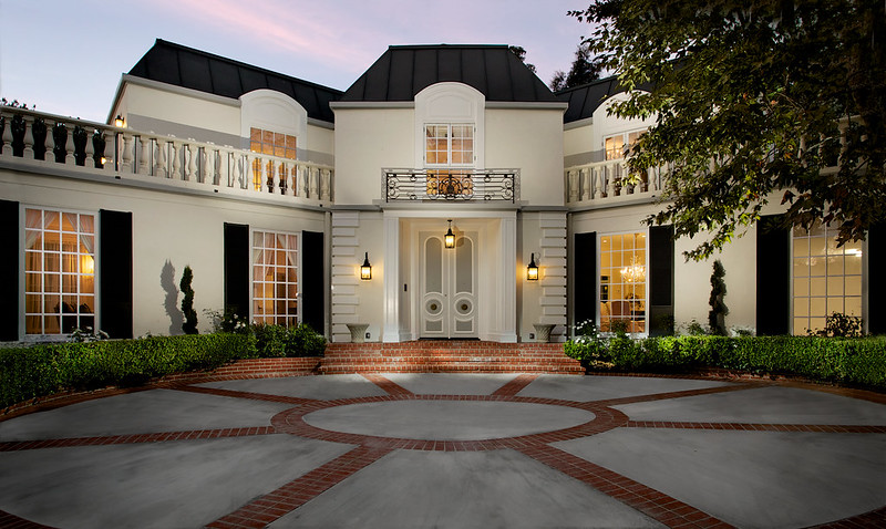
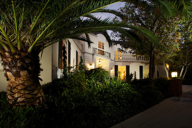
I was recently hired to photograph this architectural treasure in Beverly Hills, CA. Designed by the great Paul R. Williams, this was his last residential project before his death in 1980. Williams practiced largely in Southern California and designed the homes of numerous celebrities, including Frank Sinatra, Lucille Ball and Desi Arnaz, Lon Chaney, and Charles Correll. In addition to countless residential projects (over 2,000), he also designed and worked on many well-known public buildings in Los Angeles such as the Theme Building at LAX, The Beverly Hills Hotel, and numerous state and federal buildings in the LA area. For more reading, check out his Wikipedia page here.

Interiors Photography: Modest Retreat on Lake Malibou

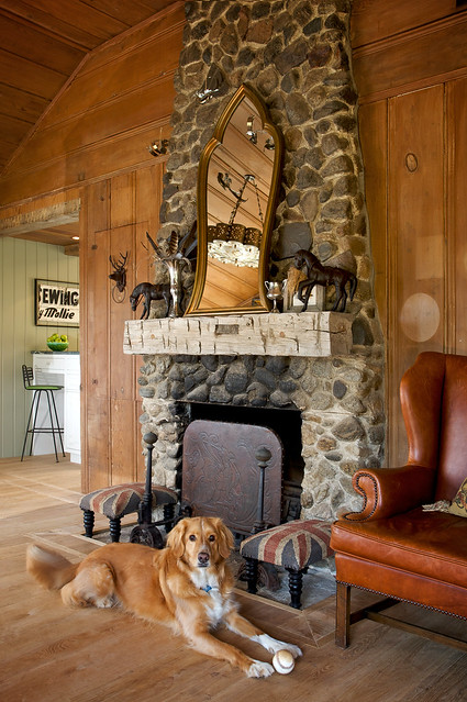
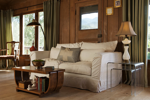
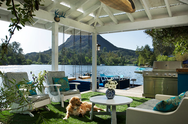
Shot for Shannon Ggem, ASID, this small property is a gem tucked away about a half an hour north of Los Angeles in the hills of Malibu. The style and decor is certainly unique to the area, and it was fun to shoot a property that had so much rustic charm. Need I mention the absolutely adorable dog who stood in as a model in a few of the shots? Too cool. I could happily waste away a few weeks in this quiet and private enclave.


Architectural Photography Of A Private Residence in the Hills of Los Feliz

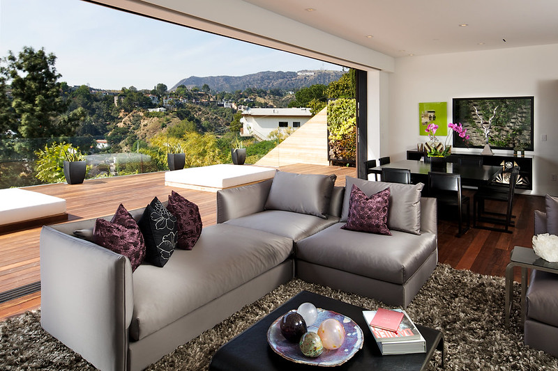
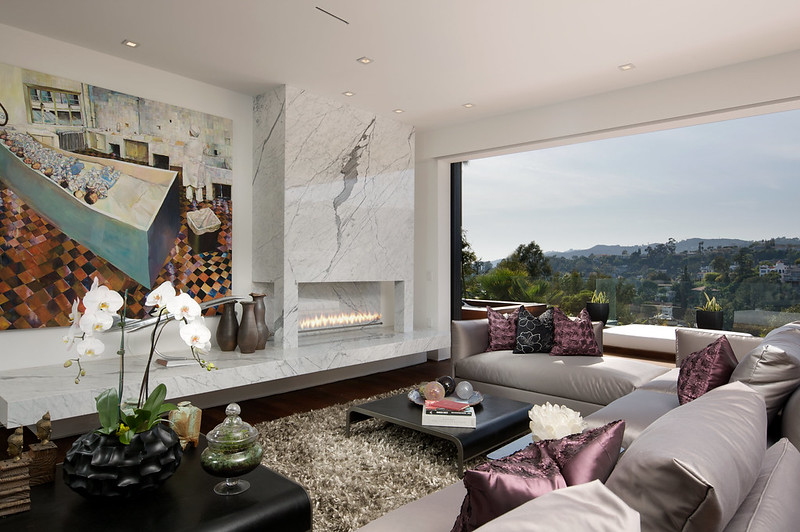
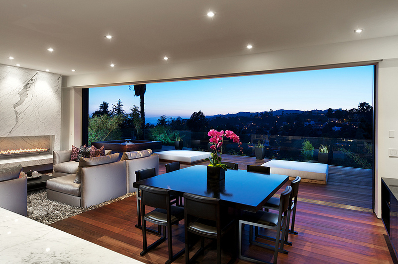
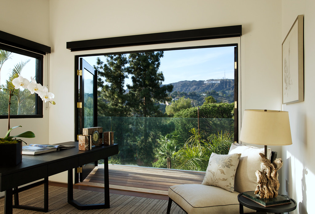
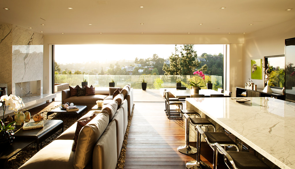
I was recently commissioned to shoot this incredible new construction in Los Feliz, CA. This shoot presented it's own series of unique challenges, however the setting allowed for some incredibly dynamic photographs. The first challenge was dealing with the extreme brightness range of the scene - that's bright, midday sun streaming in against a white interior with a dark wood deck outside. Pretty tough to keep it all in check. The following were shot with a set of Pul C. Buff Einsteins.


One of my favorite shots from the day was a result of the sun setting directly in front of the sliding glass doors which opened to an expansive view over the hills. The sun aligned perfectly with the back of the home and filled the entire place with a surreal, golden light. Definitely one of the most intriguing shots I've taken, and the best part is that it was nothing but 100% natural light. You don't always need a truckload of gear to pull off a shot, though getting lucky like this certainly makes it easier.

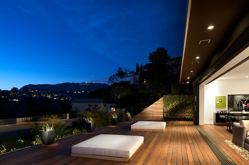
 Lastly, a couple twilight images - we know how much I love these.