lighting

Photographing a Modern Office Interior in Orange County: Ferm Design Concepts

Back in October, I had the pleasure of working with one of my favorite clients, Kelly Ferm of Ferm Design Concepts and 707 Circle Lane to photograph an office interior she designed for local Orange County startup InsuranceOnline.com. Shot over the course of just a few hours - we had to be quick in order to not interfere with the day-to-day operations of the business, which was full of workers running around and getting things done! 

The waiting room, below, lit with hot and strobe light brought out the softness in the wood and smoothly curved white armchairs. By adding shadow and highlight we were able to add plenty of depth and interest in a room lit with only overhead can fluorescents for practicals. I strive to take places like this - with interesting interior design, yet fairly standard overhead office lighting - and transform them into a soft, inviting, and flattering image that presents my clients' work better than any snapshot could.


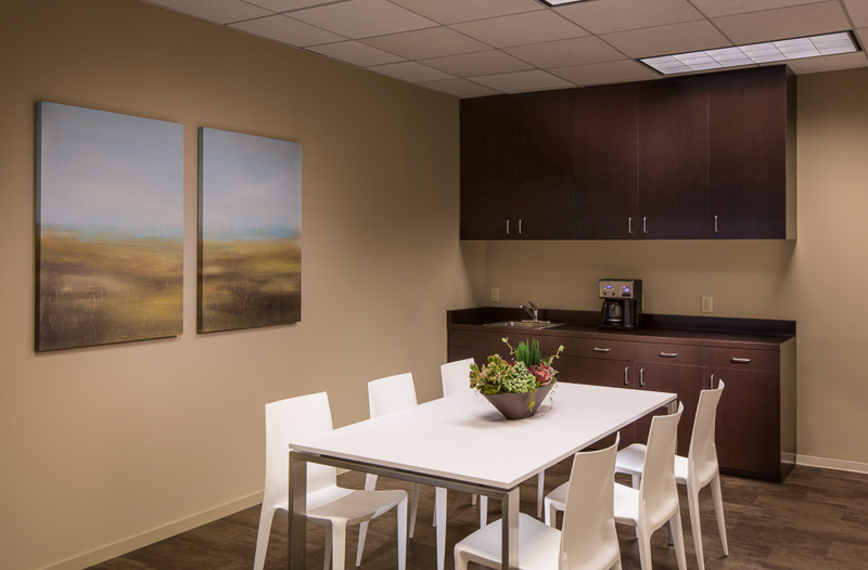
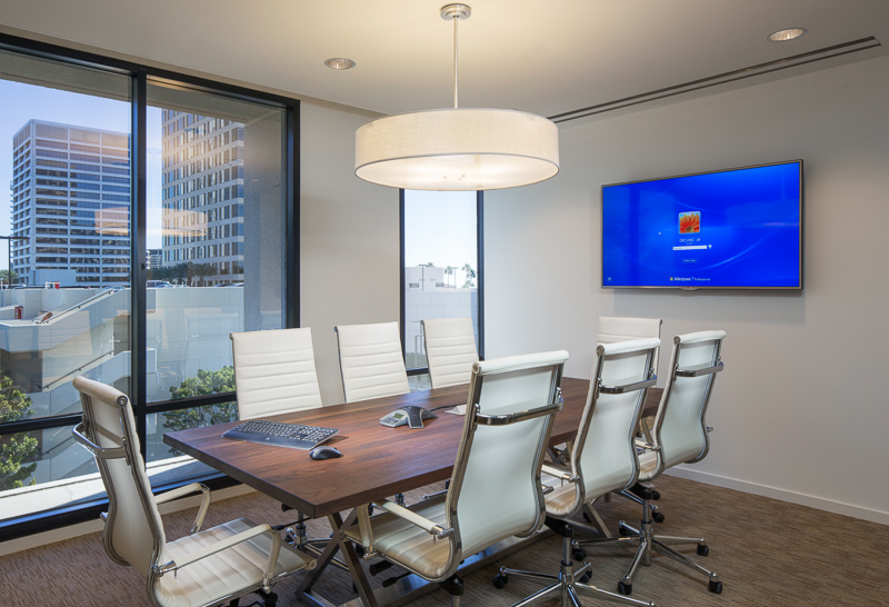
Up next, a simple conference room and break room - but bringing softness and richness to the design is a bit tricky when dealing with just ovehead fluoros. The camera doesn't quite see what the eye does, so plenty of massaging with light is necessary. Those conference room windows were heavily tinted blue, and required some serious gelling of the lights to make it all match. 

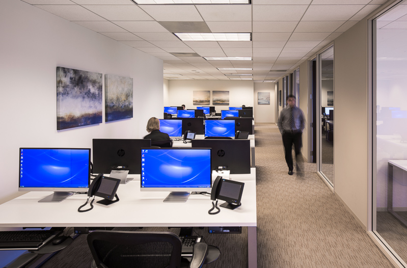
And lastly, my favorite shot from the day, and a very impromptu one at that, shot as most of the workers were at lunch. I saw this angle upon walking in and wanted to shoot it, but pulling it off would be tough. We only had about 20 minutes or so to clean, organize, stage, and light the space, which of course was tricky. Working with an assistant, we hid everything we could, arrange the desks and computers as best as possible, had a few workers stand in for models to give some life and activity, threw a couple lights up, mostly in a seat-of-the-pants fashion, and let it ride. What resulted is one of my favorite shots in recent memory. Even a simple office interior can photograph incredibly well if the architecture lends itself to it. 


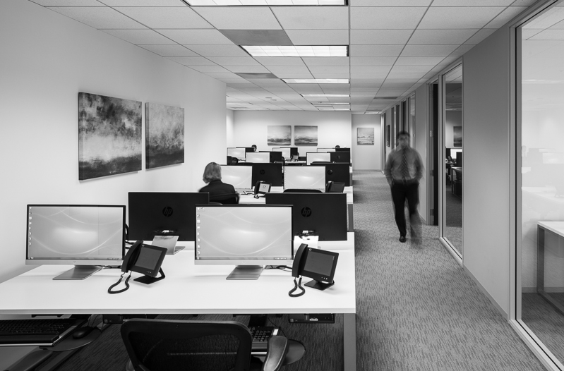
And this shot, as it turns out, lent itself to a very nice black and white conversion, which I find quite reminiscent of a few shots of Julius Shulman's. A classic, contrasty one point perspective which draws the eye in and lets you linger. Thanks, Kelly, for the great subject and chance to make some killer photos!


You'll have to excuse my lack of blogging lately, as I have been busier than ever and all over the west coast photographing (nearly 4,000 miles driven in the last two months alone) a number of different projects. Expect a lot more posts as this cools down and the holidays come up.


Architectural Photography in Phoenix, AZ: Desert Landscapes And Pastel Colors

One of the best things about being an architectural photographer is definitely the amount that I get to travel. I recently packed up the car, blew Los Angeles a kiss, and headed to Phoenix, Arizona for a week to photograph five custom homes by a builder based in Scottsdale. The client, C5 Builders, was looking to improve their advertising presence by upping the quality of their photographs.
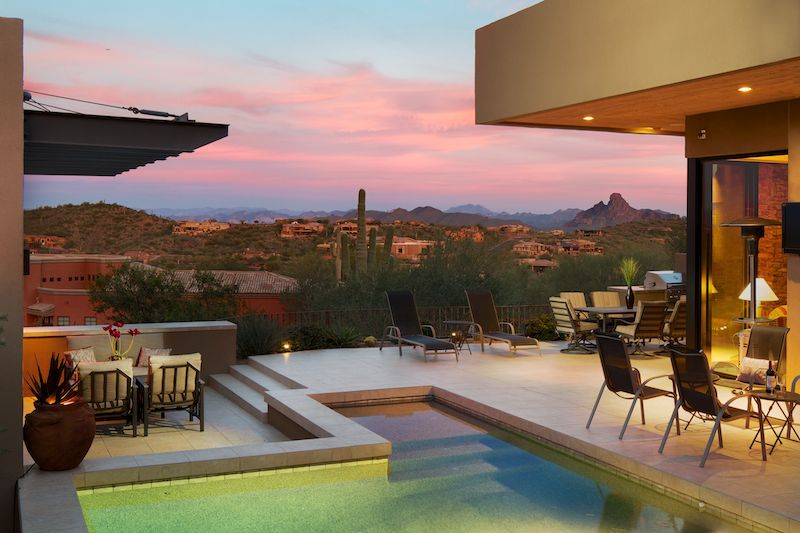
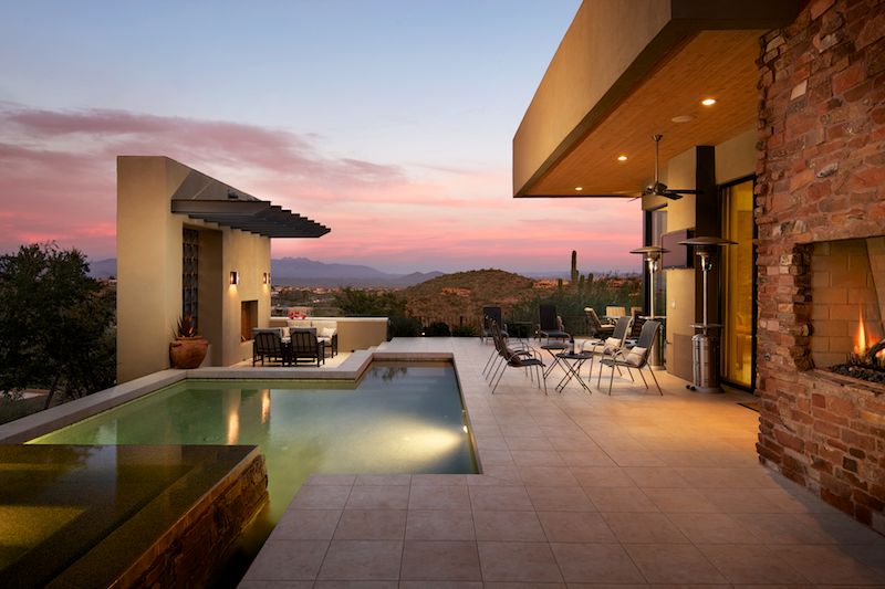
 

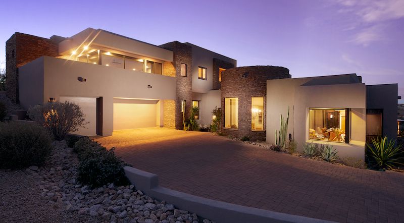
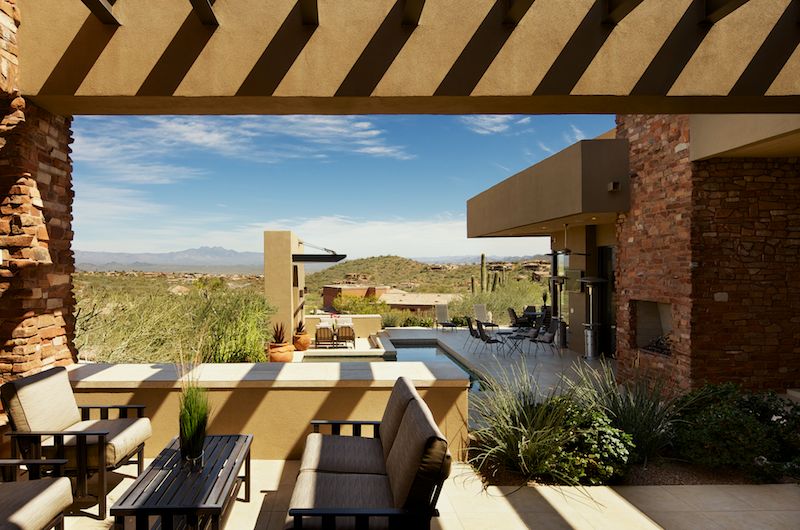
While these homes were finished between 2005 and 2011, they didn't look dated to my eyes at all. They were such a breath of fresh air to photograph:  low, flat roofs and plenty of clean lines make for an architectural photographers' paradise. My favorite thing about these homes were definitely the exteriors. While here in LA we're blessed with plenty of interesting exteriors, it's great to shoot a totally different style, and Phoenix has plenty of unique exteriors due to its climate and the desire of many architects to integrate the home into the desert landscape in such a way to not disturb it at all. Many of the homes are planned to precisely follow the existing landscape - in many areas, it is forbidden to dig more than a foot or two into the ground, and you are encouraged to build around the beautiful Saguaro cacti that populate the area. If you need to remove one, you must replant it locally, and in many cases homes are designed entirely around old growth Saguaros because of the delicate arms. It's much, much easier to relocate the young Saguaros, or spears as they are known, due to their lack of arms. If you must move one of the big guys, it takes tons of special equipment and is often done at great cost. 
 

Photographing out here definitely requires a number of alterations to workflow, as well. Because we were shooting in the spring, which is apparently the season when Rattlesnakes are the most active - we were always on the lookout (and the listenout, if you will) for that signature rattling sound. In many cases my tripod was set up in untamed desert - not many people buy into the whole concept of a manicured lawn in Phoenix - and plenty of small wildlife darted in and out of my tripod legs. It was definitely something that sat in my mind the entire time, which isn't helped by the fact that I have miserable hearing to begin with. 

Another challenge, not only to building these homes, but to shooting them as well - is, of course, the cacti that are everywhere. I'd been to Scottsdale before, but I didn't venture too far out into the desert, so I wasn't really worried about running into a cactus. However, on this trip, there were plenty of occasion where I was setting up right in the middle of a grove of cacti. It was on my second shoot of the week where I learned pretty quickly that I needed to be super, super careful where I was walking. I was taking some daylight exteriors of one home and inadvertantly brushed my left hand against a Jumping Cholla (click here for more info). Anyone familiar with these will tell you what an absolute pain in the butt they are. The thorns are covered in microscopic barbs which run in an opposite direction, so once they're in your skin, it takes one hell of a yank to get them out, which just tears up your skin even more. Since the needles are very thin and grow in clumps, once you get one stuck on your hand, you're pretty much screwed. It took about a half an hour to remove 30-some Cholla needles from my hand, and by the time the ordeal was over, my hand was shaking uncontrollably and there was enough blood on it to make an impromptu trip to donate it at the nearest Red Cross. In the heat of the moment, I totally forgot to get a picture - next time, I'll be sure to, though I'm secretly hoping there never is a next time. Ouch.

Despite the blood, sweat, and tears (first time I've ever used that expression literally), I was extremely happy with the images created on the trip. Once again, I had to adhere to a grueling shooting schedule - five homes in five days, and when all was said and done I'd shot over 60 gigabytes of material. 
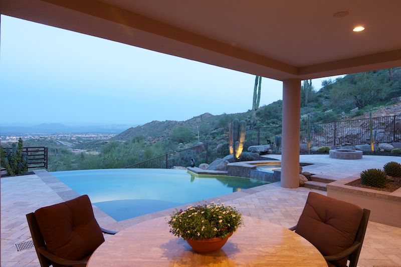
 

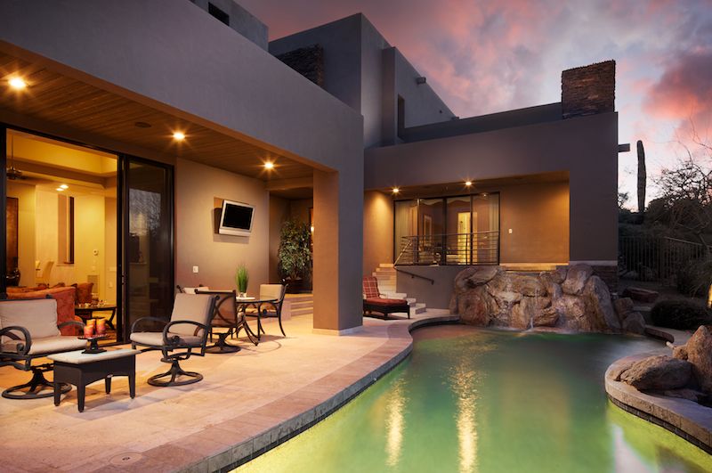
Before, after, and plenty of Saguaros...
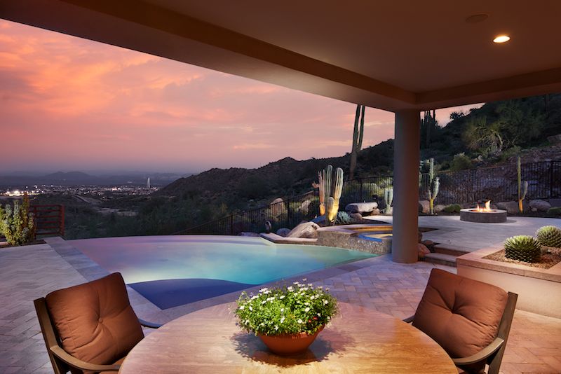
My definite favorites are the exteriors, since like I said, these are all so unique and I don't get to see anything like it in Los Angeles. A few of them underwent rather drastic changing in post-processing, as it seemed that clouds threatened the shoot every night. There were a couple nights where the gathering clouds made for some dramatic pastel sunsets which were great (as in the first couple images) but for a few nights the cloud cover was completely blocking any color from the sky, which something I definitely wasn't prepared for as Phoenix is one of the hottest and driest places I've ever shot. Just goes to show you that you can never depend on anything, even when you're shooting in the desert and blue skies are the norm. 
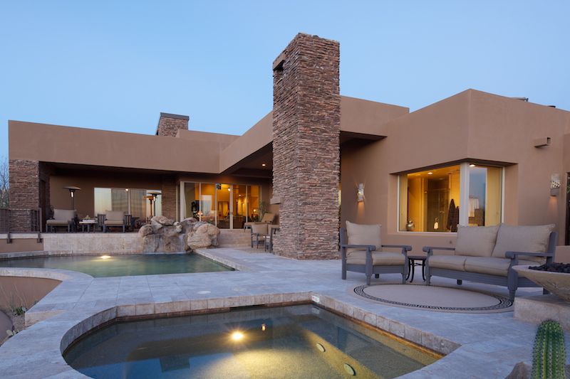
Before and after, with some Phoenician clouds...
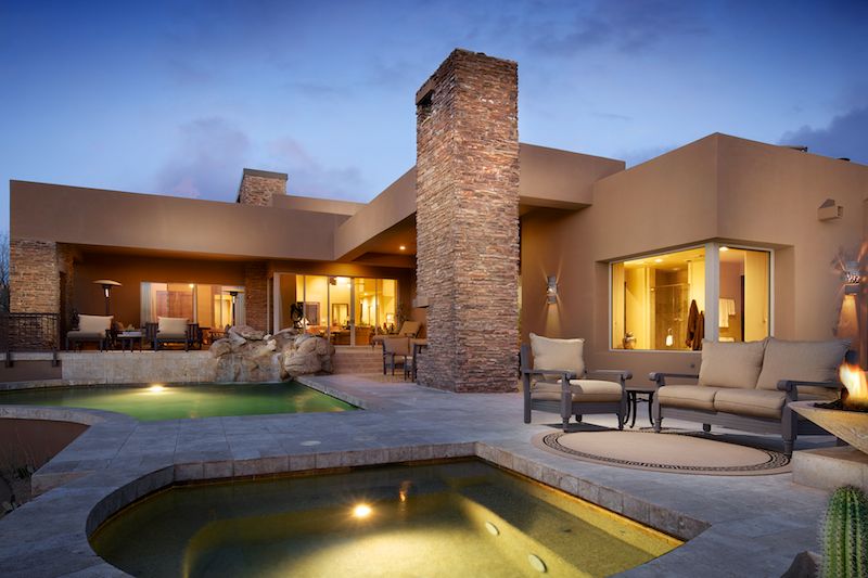
 

That's why I always preach that good skills with post processing and lighting can get you out of a bind - together those skills will ensure that you can deliver the results you want EVERY. TIME. Especially when clients are counting on it and you've traveled a good six hours from home to do it...
In addition to all of my rambling, I'm happy to announce that I've partnered with Fstoppers.com to release a ton of behind-the-scenes footage from my trip to Phoenix. It's in post production right now - and as I type this, we're putting the finishing touches on it. I had no idea how long it would take to cut together a fifteen minute long behind the scenes video, but we're getting there! So apologies for the wait - as it's been about two months in the making. Til next time...when I fly across the country and experience some Southern Hospitality!

Photographing An Architecturally Significant Home: Pasadena Greene & Greene Built in 1911

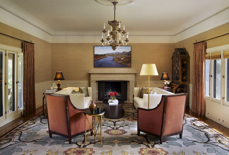
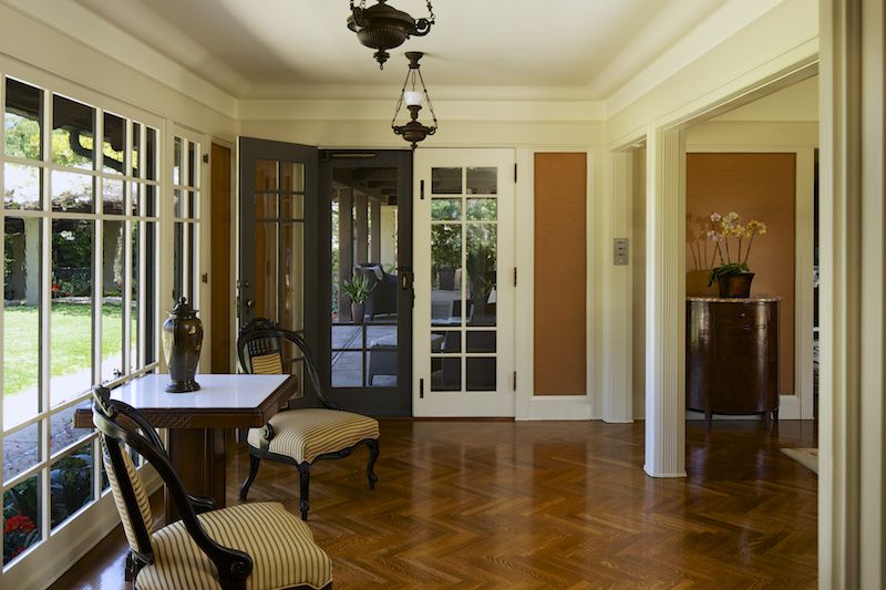
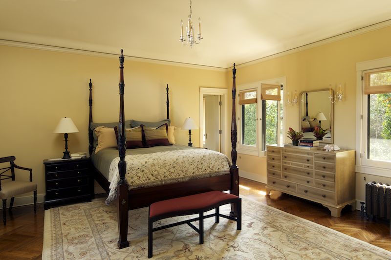
I was recently awarded an incredible opportunity: photographing a Greene & Greene home in Pasadena that had been immaculately restored and maintained. I was contacted by designer Christine Kilian (who, notably, was a major force behind the architecture and design of the renowned Getty Museum), who wanted to document the home which contained her work. In addition, the owners were interested in having photos taken as keepsakes to remember their hard work and tireless devotion to restoration.

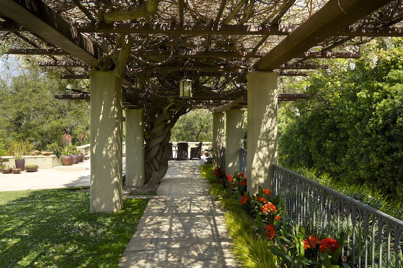
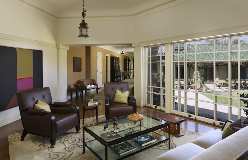
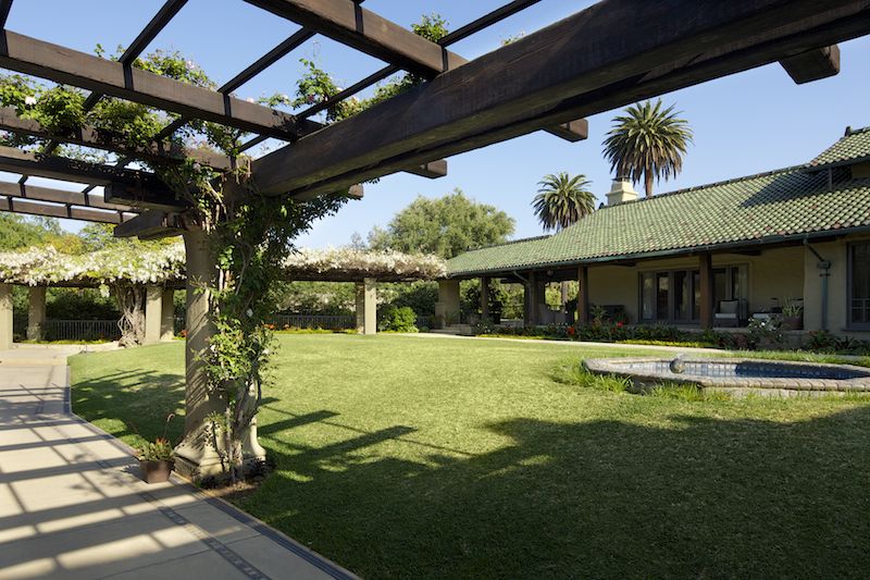
Built in 1911 by the famed brothers Charles Sumner Greene and Henry Mather Greene for three sisters from Illinois (Cordelia, Kate and Margaret Culbertson), it had cost $100,000 at the time: the equivalent of more than $2.5 million today. The home is a stunning piece of work, yet markedly different than most of the Greene & Green homes that are scattered throughout Pasadena. Instead of large, bulky, shingle-clad and relatively symmetrical designs, The Culbertson house is covered in a light tan gunite. It has a low facade, somehow resembling a Chinese temple, and a roof of glistening green tile, dashed with red flecks that reflect a varied spectrum depending on the time of day. The home is quirky in its layout; a large, yet asymmetrical U when viewed from above that gently slopes down towards private gardens with views of the mountain ranges behind Pasadena.

This was certainly unlike most homes that I've photographed, as I have spent most of my time photographing new constructions and remodels. Homes dating to 1911 in the area are exceedingly rare (this is where I also mention how jealous I am of all you shooters on the east coast, where a 300 year old home is nothing out of the ordinary), and in many cases owners update them to reflect current trends and tastes.

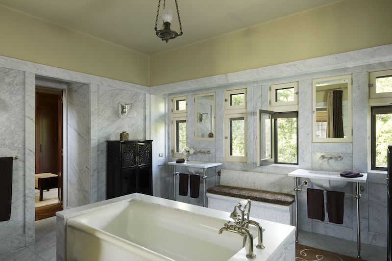
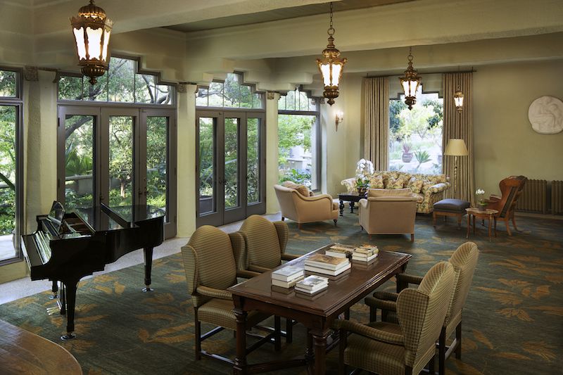
In order to maintain the feel and mood of the home, I used a lighting approach that maintained a natural look, yet also allowed for the richness and depth of the colors and textures to show in the photographs. In a home such as this, I felt it was absolutely necessary to preserve the mood and ambience of the interior. Careful attention was paid to composition and staging, and in many cases we spent over an hour perfecting furniture layouts and lighting schemes.

Some of the lighting situations from a photography persepctive were somewhat nightmarish. A number of one-point perspective compositions meant some creative light placement was necessary. Cavernous areas covered in dark paints required careful attention when aiming and positioning lights not only to avoid color casts but also to avoid reflections and maintain the natural feel. It's very easy to overlight a big space where such a wide dynamic range is present.

Despite these challenges and the all-day shoot (nearly 12 hours for 12 staged and lit images), everyone involved was thrilled with the outcome. I hope the extra time we put into staging and preparing the space shows, and I know that these images will be used for years to come by everyone involved. Creating timeless images takes time, but I hope you'll agree that the results are worth it!