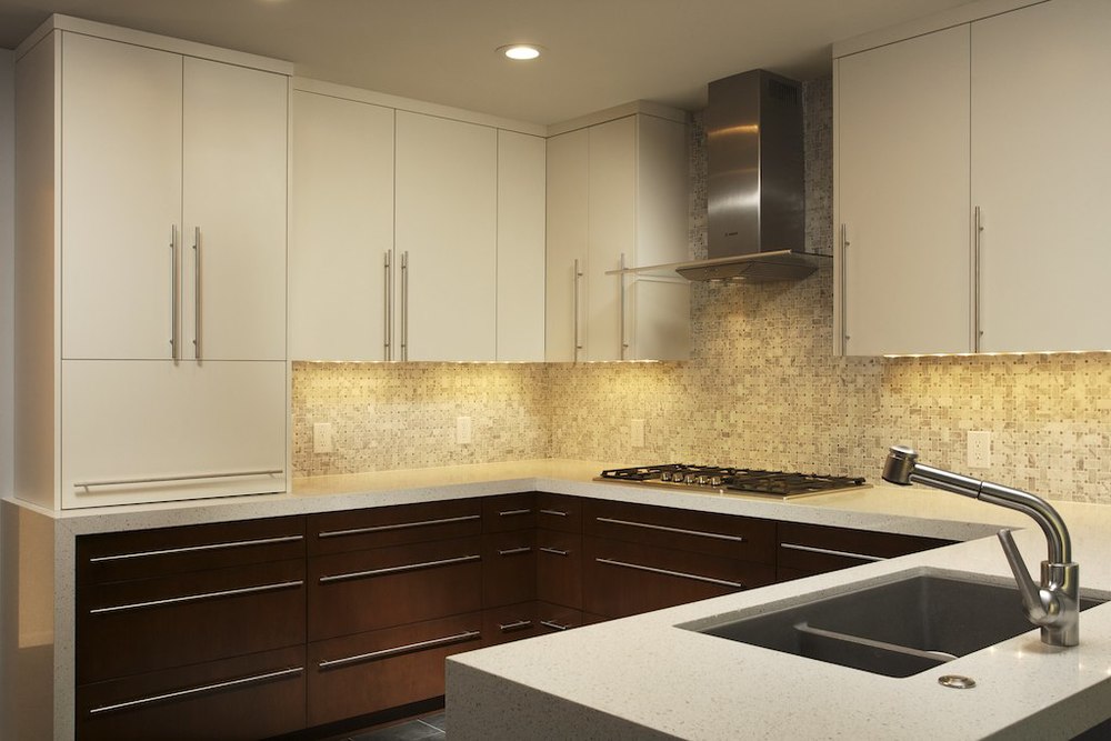
Here is an example of what artificial light can do for an interior photo. While there are many instances where natural light may be all you need, this is a relatively common scenario that I see interior shooters struggling with on a regular basis.
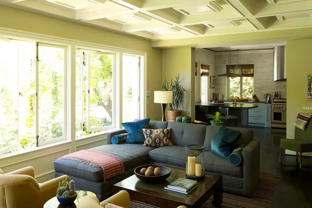
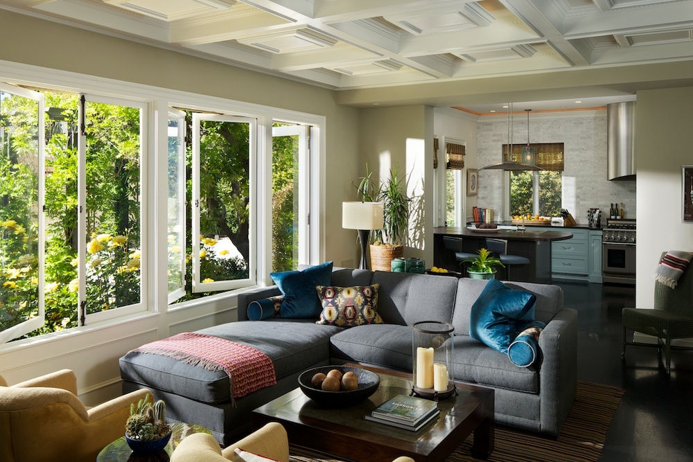
pasadena
Here is an example of what artificial light can do for an interior photo. While there are many instances where natural light may be all you need, this is a relatively common scenario that I see interior shooters struggling with on a regular basis.


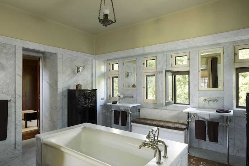
I was recently awarded an incredible opportunity: photographing a Greene & Greene home in Pasadena that had been immaculately restored and maintained. I was contacted by designer Christine Kilian (who, notably, was a major force behind the architecture and design of the renowned Getty Museum), who wanted to document the home which contained her work. In addition, the owners were interested in having photos taken as keepsakes to remember their hard work and tireless devotion to restoration.
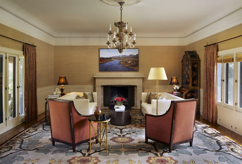
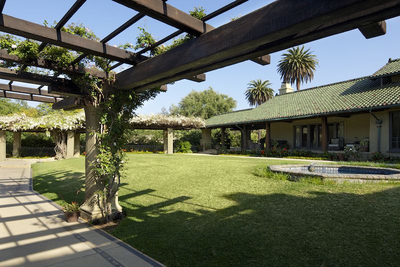
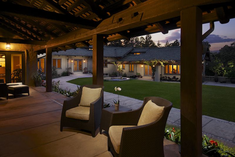
Built in 1911 by the famed brothers Charles Sumner Greene and Henry Mather Greene for three sisters from Illinois (Cordelia, Kate and Margaret Culbertson), it had cost $100,000 at the time: the equivalent of more than $2.5 million today. The home is a stunning piece of work, yet markedly different than most of the Greene & Green homes that are scattered throughout Pasadena. Instead of large, bulky, shingle-clad and relatively symmetrical designs, The Culbertson house is covered in a light tan gunite. It has a low facade, somehow resembling a Chinese temple, and a roof of glistening green tile, dashed with red flecks that reflect a varied spectrum depending on the time of day. The home is quirky in its layout; a large, yet asymmetrical U when viewed from above that gently slopes down towards private gardens with views of the mountain ranges behind Pasadena.
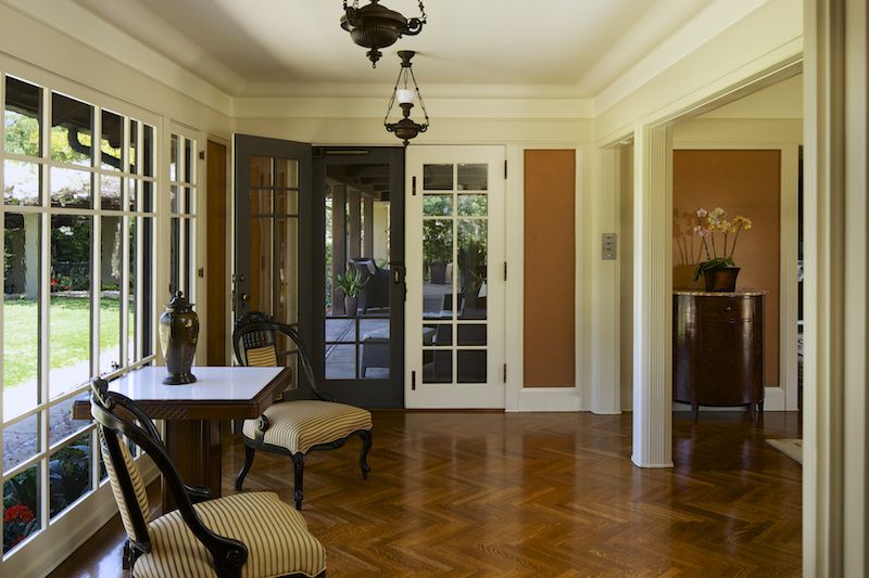
This was certainly unlike most homes that I've photographed, as I have spent most of my time photographing new constructions and remodels. Homes dating to 1911 in the area are exceedingly rare (this is where I also mention how jealous I am of all you shooters on the east coast, where a 300 year old home is nothing out of the ordinary), and in many cases owners update them to reflect current trends and tastes.

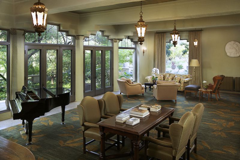
In order to maintain the feel and mood of the home, I used a lighting approach that maintained a natural look, yet also allowed for the richness and depth of the colors and textures to show in the photographs. In a home such as this, I felt it was absolutely necessary to preserve the mood and ambience of the interior. Careful attention was paid to composition and staging, and in many cases we spent over an hour perfecting furniture layouts and lighting schemes.
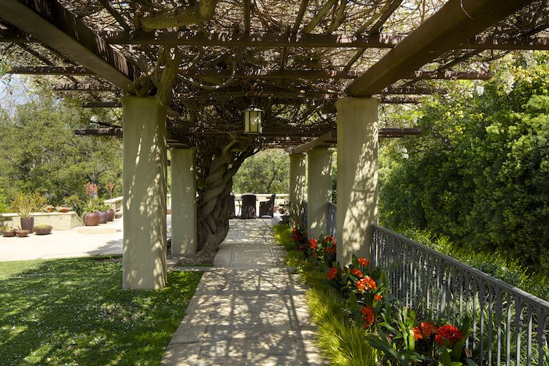
Some of the lighting situations from a photography persepctive were somewhat nightmarish. A number of one-point perspective compositions meant some creative light placement was necessary. Cavernous areas covered in dark paints required careful attention when aiming and positioning lights not only to avoid color casts but also to avoid reflections and maintain the natural feel. It's very easy to overlight a big space where such a wide dynamic range is present.
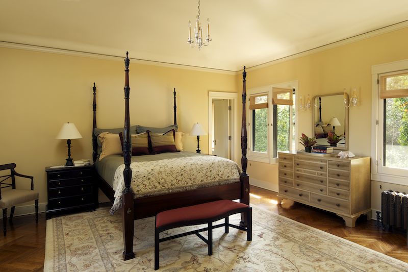
Despite these challenges and the all-day shoot (nearly 12 hours for 12 staged and lit images), everyone involved was thrilled with the outcome. I hope the extra time we put into staging and preparing the space shows, and I know that these images will be used for years to come by everyone involved. Creating timeless images takes time, but I hope you'll agree that the results are worth it!
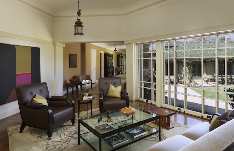
One of my long time clients, Future Home Builders, recently finished this gorgeous remodel of a 1950s home in Pasadena. I absolutely adored the kitchen: the perfect size and just modern enough without being over the top. Clean lines and nice mood lighting made for a great environment. The lighting setup here was relatively simple, just two speedlites out of frame, and a few additional frames of painted light which were then composited together to get the wood grain and lines to pop a bit.
